Before and after: The House that Black Built’s bathroom makeover
Find out how this interiors blogger got the luxury look for less in her Victorian bathroom transformation.

Image: Chelsea Stonier
We spoke to interiors blogger Chelsea Stonier of The House that Black Built who revealed the secrets behind her stunning Victorian villa makeover. She recently renovated the property and used a monochrome palette that screams sophistication and style.
We found out how she managed to revamp her bathroom to create a unique statement suite, and all on a modest budget.
Before
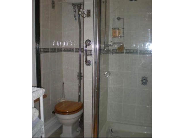
Image: Chelsea Stonier
The design of the bathroom was outdated before, with no clear colour scheme or theme to tie the room together.
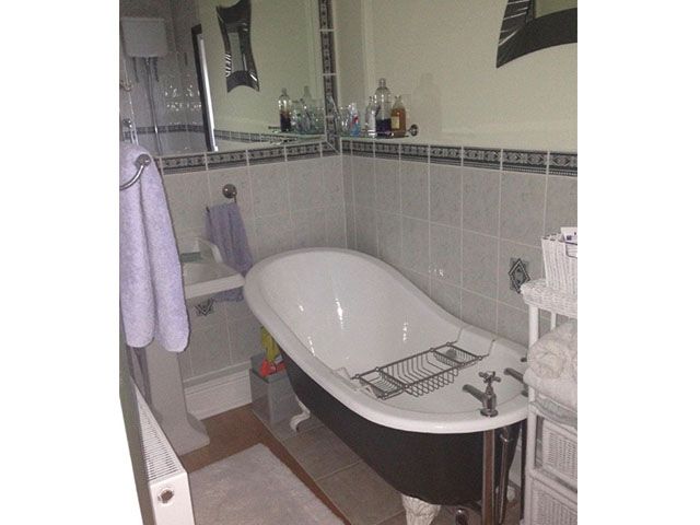
Image: Chelsea Stonier
The only redeeming feature was the cast iron roll-top and claw-foot bath, which she decided to use as her inspiration for the revamp.
After
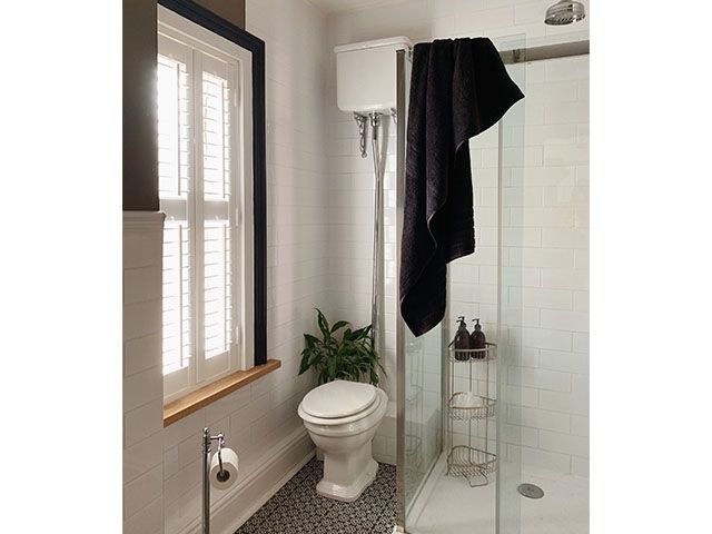
Image: Chelsea Stonier
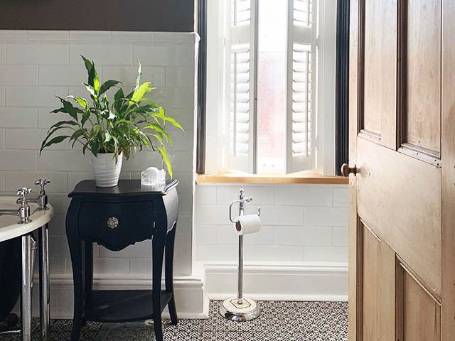
Chelsea opted for a monochrome scheme to add some class to the bathroom. While white gives it a fresh feel and dominates most of the bathroom, she added some drama and depth with some beautiful black and white floor tiles.
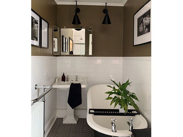
Image: Chelsea Stonier
Chelsea now has a bathroom design that compliments and shows off her stylish bath. However, to prevent the bathroom from looking too sterile, which is a risk with monochrome schemes, an interesting brown colour was chosen to cover the top half of the bathroom – adding a twist on the traditional Victorian look.
Hear what Chelsea has to say about her renovation project…
Where’s the best place to start when renovating a room?
“To me, it’s really important to honour the age, character and feel of your home before giving it your own stamp. When purchasing new bits and pieces, try to expand on what you already have and enhance the existing features.”
How do you balance modern and vintage pieces?
“We were very lucky to inherit a cast iron roll-top and claw-foot bath, which has led the way for us in terms of design. We wanted to be sympathetic to the Victorian era but give it a modern twist, and our choice of tiles really drove this forward.
“We chose a clean and simple elongated, white gloss metro tile for the walls, topped with a traditional border. By keeping it all the same colour, it was easy to apply a modern look to the classic room. If you have a small bathroom like ours, with minimal natural light, I’d suggest white gloss to help reflect the light.”
What was the statement purchase for your bathroom?
“As the wall tiles were so simple, we wanted to go for drama on the floor. We chose a beautifully patterned monochrome floor tile to add interest, it’s a way to wow without being overpowering.”
What’s the best way to save money on hiring help?
“DIY and upcycle! We give almost everything a go ourselves, with no prior experience or knowledge. If we can save on labour, we get to spend on products that we really adore instead, plus you get the added satisfaction of having done something yourself! I personally see plantation shutters as being an investment for resale too – they add extra value. I’d be thrilled if they were already installed in a potential new home.”
What do you think of Chelsea’s Victorian bathroom makeover? Let us know by tweeting us @goodhomesmag or post a comment on our Facebook page.


