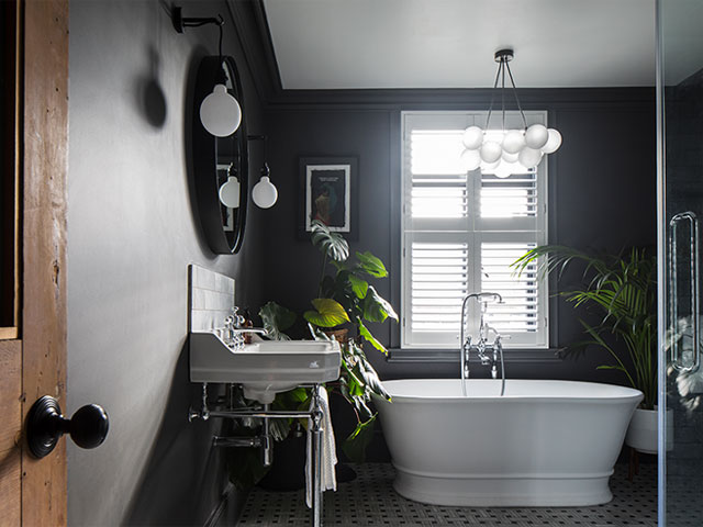
A dramatic dark grey bathroom renovation
Hairdresser Oliver Cunningham has combined dark walls and vibrant artwork to create a dramatic dark grey bathroom scheme in his Victorian terrace in Hove…
Oliver Cunningham decided to change a bedroom into the main bathroom while renovating the four-bedroom Victorian terrace he bought in Hove in August 2018. The project involved taking space from the old bathroom to allow for a double shower. Here, he tells Good Homes magazine all about his dramatic new dark grey bathroom scheme…
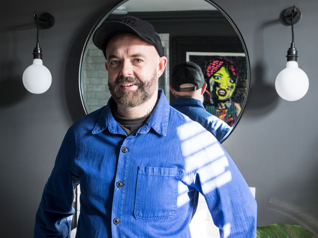
Oliver Cunningham in his new bathroom. Photo: James French
Why did you decide to sacrifice a bedroom to create a bathroom?
I’d converted the loft into two bedrooms and a shower room, and kept my main bedroom on the first floor. I wanted the bathroom to be spacious, relaxing and luxurious. As the old one was small, it was ideal for an upstairs utility room as there wasn’t space for one downstairs.
What inspired your new scheme?
I saw a Pinterest picture of a dark grey bathroom with a marbled floor in a Parisian apartment, and I loved its timeless, elegant look, but also its calm simplicity. I saw a similar bathroom in a client’s townhouse in Notting Hill and was blown away – double doors opened onto a marble-clad room with a roll-top bath in the middle, a huge chandelier above and a glass cube shower. It looked like a really lavish space rather than a functional bathroom, and that concept stuck in my mind.

Oliver has gone for a timeless, elegant look. Photo: James French
How did your ideas evolve?
I bought an old French crystal chandelier and while I was looking for similar wall lights, I had a change of heart – having both would have looked too glitzy. I’d also realised the chandelier was actually too big and too low above the bath, so I went looking for lighting inspiration at some of my favourite companies – Graham & Green, Rockett St George and Dowsing & Reynolds. At the latter, I discovered the frosted bubble chandelier and wall lights – they’re contemporary, and I like the contrast with the old, so I ran with this idea instead.
How did you plan the layout?
Although the room is about 3×3.5m, there was really only one option. It made sense to keep the toilet waste on the outside wall and since the double shower was my must-have, this was positioned on the longest wall. I’d really wanted the freestanding bath in the middle of the room but there wasn’t space, so instead, below the window, it’s the first thing you see when you come into the room.
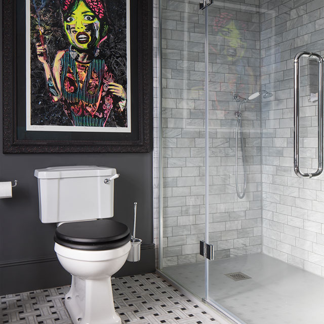
Brightly coloured artwork adds a pop. Photo: James French
And what about the fixtures and fittings?
I love a freestanding Victorian-style bath but didn’t want a cast-iron one because, from previous experience, the water cools too quickly. I ruled out a plastic bath because they’re too flimsy, but found a gorgeous stone tub, which is silky smooth to touch. Getting the frameless shower enclosure right was important, and a big investment, so I didn’t buy online, instead going to local bathroom shop Leaneys of Lancing to see it for myself – the glass is 10mm thick, as I wanted it to be sturdy and it’s such a luxury to use.
Would you do anything differently now it’s finished?
The layout isn’t perfect – if I open the shower door too wide it collides with the toilet, but I’d already bought the cubicle when I discovered this. And since I parted ways with my builder, I probably would have had a better experience with a bathroom company, who would have also prepared a scaled CAD drawing.
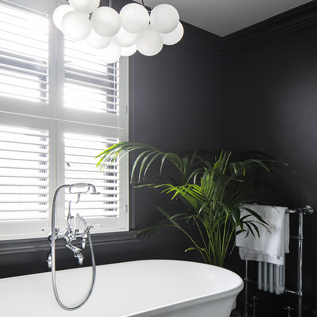
The contemporary bubble chandelier from Dowsing & Reynolds contrasts with the heritage features. Photo: James French
What’s been the biggest success?
Definitely the cornicing I had put in. It’s given the bland space elegance and style, and made the bathroom feel like a proper room – guests always comment on how lovely it looks.
PROJECT COSTS
- bath £1,500
- shower £1,400
- basin £785
- taps £700
- toilet £320
- tiles £3,000
- lighting £270
- towel radiator £220
TOTAL SPEND: £8,195
Styling: Marisha Taylor


