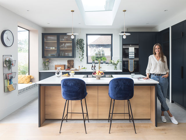
‘We sacrificed some bedrooms to create a luxurious home’
Laura Smith, a solicitor, and her husband Jamie, a project manager, bought a four-bedroom home in Wanstead, east London in 2018. It had scope to extend out the back and into the loft, making it just the kind of project they were looking for with plenty of space for their two daughters, Isla, 8 and Olivia, 6, to grow into.
The couple’s previous home was a narrow Victorian terrace, so they were drawn to the wide dimensions and big garden of the 1930s semi-detached house.
‘We had to be imaginative though, as the property was horrendous,’ Laura recalls. ‘Every room was stuffed to the brim, dark, depressing and filthy.’
After the sale went through, the couple had two weeks to blitz the house before they moved in, knowing they’d have to live like this for another year until they could start any major renovation work. So rooms were fumigated and white-washed, carpets replaced with inexpensive lino and a basic kitchen fitted.
Local estate agents suggested that turning the property into a six-bedroom house would have more appeal if they decided to sell in the future, but Laura and Jamie felt a comfortable home that worked for their family was more important. ‘We didn’t need all those bedrooms, so we decided to turn two of the smaller ones into part of a main bedroom suite for us,’ says Laura.
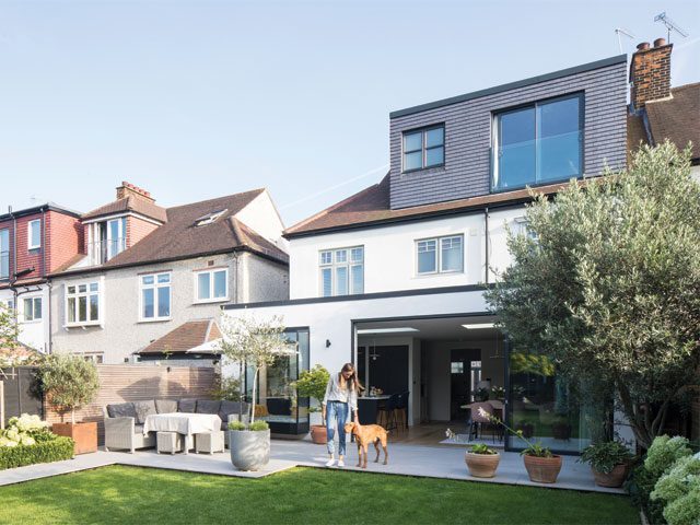
A double extension and loft conversion has created all the space the family need, with their two girls bedrooms in the loft and a large bedroom suite across the back of the house. Photo: Adam Scott
Planning a renovation
Over the next year, the couple put together a project plan, with the obvious change being to knock through the kitchen to the dining room and extend. Converting the loft into bedrooms and a bathroom for daughters Isla and Olivia worked well, but left them with four original bedrooms on the first floor.
‘We wanted a guest room for Jamie’s parents, who regularly visit, but I couldn’t see us using the two smaller bedrooms very often,’ Laura explains. ‘So it made sense to turn one of them into a guest bathroom next to the room at the front of the house.’
As the couple’s bedroom lacked an en suite, Laura’s dad, a property developer, suggested they take over the entire back of the house and create one luxurious space.
‘We were a bit nervous about losing the bedrooms, but it made sense to turn the old bathroom into our en suite, and the adjoining fourth bedroom was ideal as a dressing room,’ says Laura. ‘It was the best decision, as we use all of the space every day.’
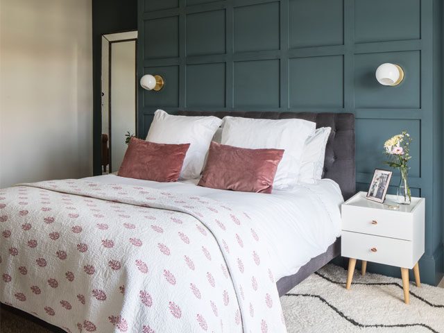
Wood panelling painted in Farrow & Ball’s Inchyra hides the chimney breast in the main bedroom. The Souk wool rug and brass lighting from West Elm add a hotel room feel. Photo: Adam Scott
A two-phase project
The couple split the building work into two phases and hired builders Summit Group after recommendations from friends, moving into a rental for six months in February 2019 while the team tackled the loft and first floor. Phase two began in February 2020, extending and opening-up downstairs and converting the garage into a utility.
Lockdown caused a short delay, but the team were able to carry on by using the side access, while the family set up a kitchen and home school in the front living room.
‘We were able to monitor their progress and we were really impressed with the team’s work ethic,’ Laura recalls. ‘Slow deliveries and delays to materials added a couple of months to the schedule, so it was lovely to have upstairs furnished to retreat to.’
The kitchen, by Made by Greg Cox, is a modern take on the Shaker style with a thin edge around the doors and wood on the island to contrast with Farrow & Ball’s Railings. Photo: Adam Scott
Creating a décor scheme
Laura used Pinterest boards to collate decorating ideas, and began to see themes emerge from her saved images. ‘I love colour but I didn’t want to use too much, partly because life is crazy busy and I needed to be able to come in, close the front door and feel calm,’ Laura says. ‘I like teaming the darks with the lights, touches of plaster pink, and muted Scandi tones, such as wood flooring, simple wood furniture and neutral walls.’
Laura sought out the right shade of white she could decorate with everywhere. ‘I was looking for a tone that wasn’t too bright, grey or beige,’ she says. ‘Farrow & Ball’s Strong White is somewhere in between and sets off everything I put with it.’
Decorating the upper two floors became Laura’s reference point for downstairs where wood panelling and wardrobes in the couple’s bedroom have been painted in Farrow & Ball’s deep blue-grey shade Inchyra, and a similar dark and light combo repeats in the kitchen, with cupboards in the blue-black Railings.
‘I’m a quiet person, and perhaps that’s reflected in my interiors,’ says Laura. ‘I like how the blues feel like calm neutrals, while contrasting with the warm white and complementing the hints of pink.’
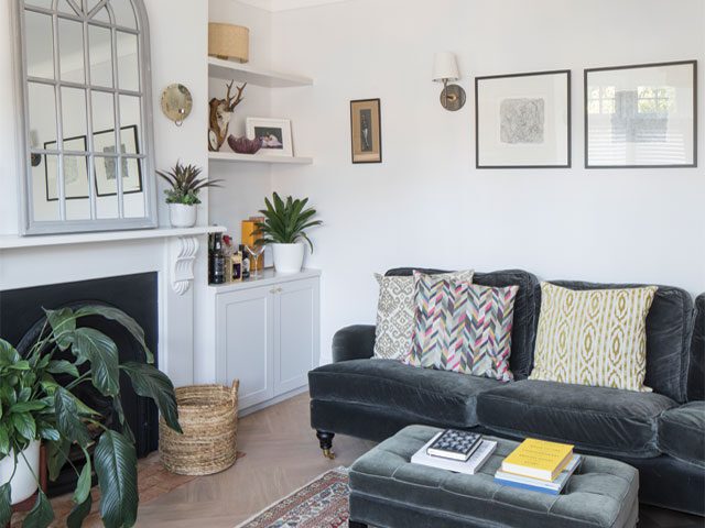
The couple wanted a smarter look for the front living room, adding colour to their existing grey velvet sofa and footstool from Sofa.com with a Persian rug Laura’s parents gave to them. Photo: Adam Scott
Scandi meets Mid-century
With further nods to Scandi style, flooring became another anchor point, where instead of carpet Laura opted for pale oak planks and a large rug in their bedroom, and engineered oak in the front living room and extension.
‘Wood feels so nice underfoot, and is practical as it can be mopped,’ says Laura. ‘I chose herringbone in the living room, which I love; I just wish I’d been brave enough to use it throughout downstairs – I just thought it would be too much. But you learn something from every project to take to the next.’
The couple’s furniture is mostly new, with plain wood Scandi styles alongside original or new Mid-century pieces complementing Laura’s vision for calm and simplicity. A wall of floor-to-ceiling shelves in the extension living area are her pride and joy. ‘We’d looked at buying units but they were so expensive, and Summit Group’s carpenter was amazing,’ she says.
‘So between us, we drew the design on the plastered wall and he made the shelves exactly as we wanted, and I love them.’
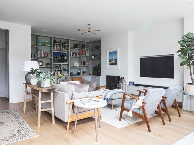
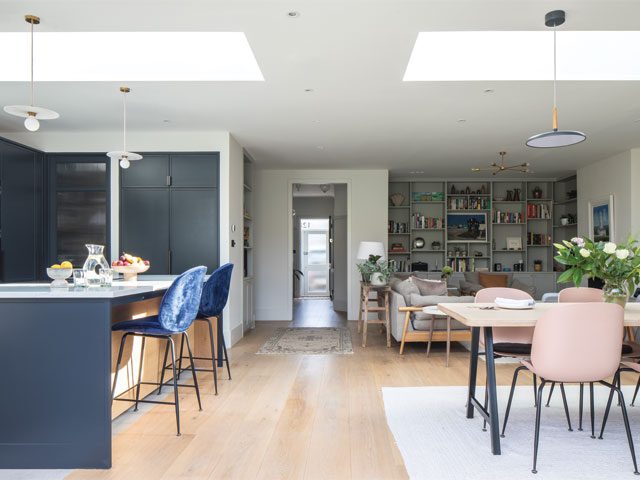
Laura was drawn to a clean, calm Scandi look with plenty of uncluttered circulation space in the extension. But to add character, her carpenter built bespoke display shelving based on her Pinterest boards. A DFS Hoxton armchair and sofa, Benuta rug and five-arm brass chandelier from Spark & Bell furnish the space. Photo: Adam Scott
Creating character
‘I didn’t want the extension to look like a bland box so I created focal points by keeping the old fireplace and adding display shelving, which the carpenter made based on my Pinterest board,’ says Laura. A DFS Hoxton armchair and sofa, Benuta rug and five-arm brass chandelier from Spark & Bell complete the living room space.
The kitchen, created by Made by Greg Cox, is a modern take on the Shaker style with a thin edge around the doors and wood on the island to contrast with Farrow & Ball’s Railings. Spark & Bell’s Smile Arc pendants were customised with a brass lamp holder and pink cables, and the Bella blue bar stools are by Diiiz
In the dining area, the Maxlight sliding doors go right to the ceiling to maximise the light, and Greg crafted the table using leftover American ash floor planks and metal trestle legs from Etsy. Pink Beetle chairs by Gubi and a G-Plan sideboard add the finishing touches. ‘I love the Mid-century look, and found this sideboard on Ebay in immaculate condition,’ says Laura.
Now the whole house is finished, the family are really pleased with the outcome. ‘Every time I come home, I think “this is a lovely place to live”,’ says Laura. ‘I especially love our bedroom, which feels like a luxe boutique-hotel room. I’m so happy and settled living here.’
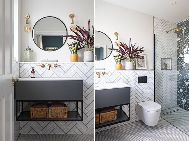
The couples en suite is tiled in white herringbone tiles from Fired Earth with Lily Pad Admiral tiles from Ca’ Pietra in the walk-in shower. Sleek Edison wall lights by Industville frame the Dwell mirror above the Modus vanity unit from Lusso Stone. Photo: Adam Scott
For more on Laura and Jamie’s home, follow @renovate128 on Instagram
Styling: Marisha Taylor


