Bathroom makeover: ‘It has a hint of the Orient Express’
A trip of a lifetime inspired Eilis Dolan to bring some Art Deco glamour into her scheme

Image: Colin Poole
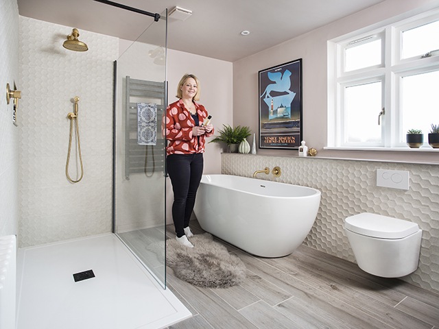
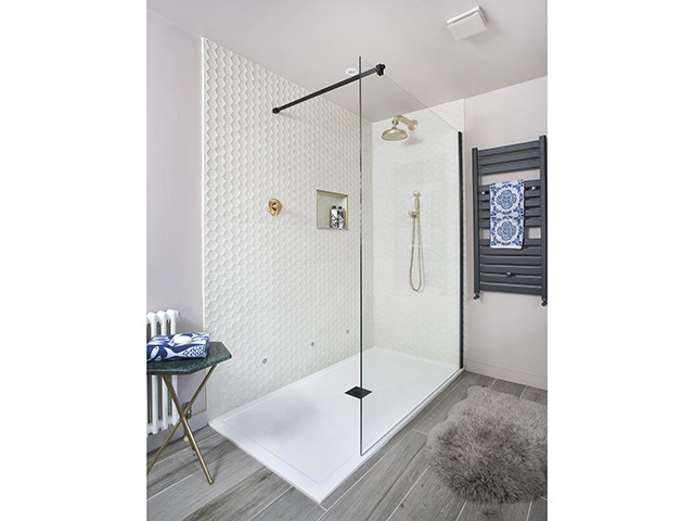
Eilis Dolan, a housewife, and her husband Richard Scott, an insurance broker, wanted to redesign the layout of her bathroom to fit a larger shower and create a 1920s inspired theme with a modern twist. The main focus of Eilis’ brief was to make space to include a large walk in shower, complete with a frameless pane of glass.
What was wrong with your original bathroom?
[twenty20 img1=”14389″ img2=”14390″ offset=”0.5″ before=”Art deco inspired bathroom makeover ‘Before’ image” after=”Art deco inspired bathroom makeover ‘After’ image”]
Image: Colin Poole
I never hated my old bathroom, but I knew it was time for an upgrade! Unfortunately the tiles were starting to crack and the paintwork was in desperate need of a fresh coat. The colour scheme was also very mundane, and I really wanted a softer, warmer tone for the space.
Did you have any big ideas for the new design?

Image: Colin Poole
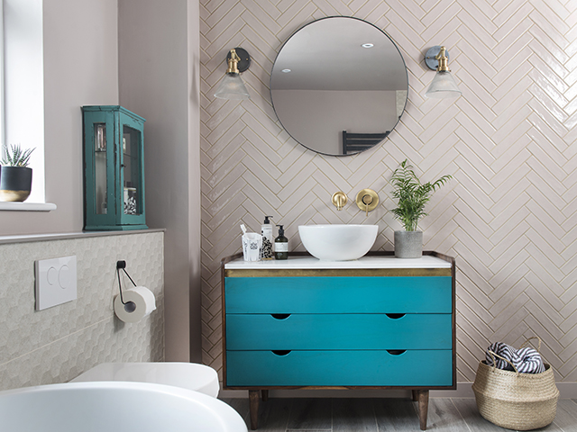
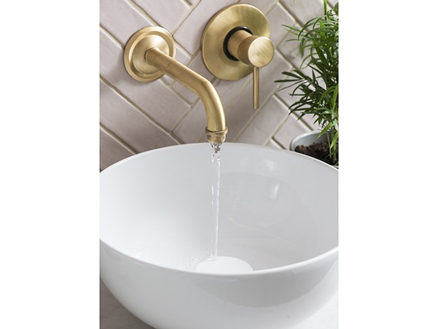
My partner and I had recently returned from a wonderful trip on the Orient Express, and we were both inspired by the Art Deco design – a style that we have always loved. My eye was then drawn to brass effect elements, which I wanted to incorporate within the vanity unit and both the shower and bath. I was also after a bigger shower, and to do that I knew we had to change the whole layout, which actually worked perfectly in the end, as the bath now sits closer to the window.
How did you make the budget work for you?
We both worked with Fiona Duke Interiors to pull the whole project together, and she was wonderful at showing us a range of different prices and quality of products.
Are you pleased with the result?

Image: Colin Poole
I absolutely love the bathroom makeover. It feels so much warmer, but still has great light. I would say that my favourite element is the vanity unit which Fiona upcycled using a retro cabinet as a foundation – I love the teal colour, which goes perfectly with the brass taps. The tile design we chose has a great honeycomb effect, so are a beautiful feature in their own right. The Bera & Beren design from Domus Tiles contrasts beautifully against the sleek white sanitaryware.
Would you do anything differently?

I don’t think I would change anything. Fiona was such a great designer to work with, and knew exactly what I wanted – nothing was too much trouble, and her attention to detail on the design was marvellous, which made the task of getting it right so much easier. For example, blending the grout colour with the tiles brought warmth to the space and let the coveted brass fixtures sing.
Project costs
- Sanitaryware £2,712
- Taps and showerhead £1,400
- Tiling £1,400
- Flooring £750
- Radiator £195
Total spend: £6,457


