Colourful, period terraced house tour
Determination, savvy spending and plenty of hard work has enabled Louise McGerty and husband Paul to create a colourful yet contemporary terraced house
This article contains affiliate links, of which we earn a commission
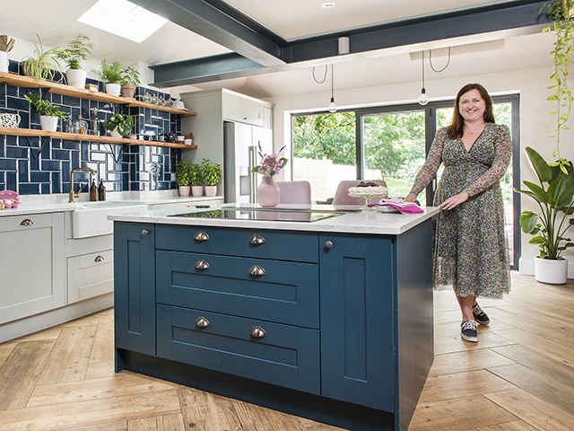
Image: Colin Poole
House-hunting is not for the faint-hearted, as Louise McGerty (@the_little_pink_nest) and husband James Harper discovered when they began searching for the perfect family home in Bristol. Faced with an incredibly competitive market, properties reaching far above their asking price, sealed bids and bidding wars, the situation felt hopeless.
But then the couple’s luck changed. Upon hearing about a pretty terraced house that had just been reduced in price, James visited the property with his mum, and put in a bid before Louise, who was at work at the time, had even had a chance to see it. ‘I only finally saw the house a few months later!’ admits Louise. ‘We had seen so many properties by then, but they were all a lot smaller than this one.’
The couple bought the three-bedroom, 19th-century terraced house in Bristol for £250,000 in 2015; it’s currently worth £450,000. And it’s easy to see why they felt so drawn to this house; situated in Harbourside, an area renowned for its café culture, and a short walk from shops and a theatre, the property sits pretty on a rainbow row of terraced houses.
Read on to take a detailed tour of their charming colourful terrace with pink exterior and learn about the challenges they faced…
Baby steps
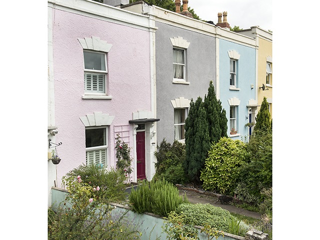
Image: Colin Poole
As is often the case with older properties, it needed a fair amount of work. As well as a dated décor, the terrace had a galley kitchen, with a bathroom behind, both of which were in poor condition. It took the couple four years to save up for the home renovation works. Nonetheless, they were thrilled when they could finally get cracking.
They hired a local architect through their builder and began work on the much-needed side extension in April 2018. But although it should have been a straightforward project, it wasn’t completed until February 2019. ‘With two very young children, and daughter Olive crawling, it was horrible at times,’ recalls Louise. ‘We shouldn’t have stayed living here really, but we didn’t have money to rent somewhere else.’ Louise and James remained stoic, setting up a temporary kitchen in a bedroom, and when it came to bath time, they would pop down the street to visit Louise’s sister.
Living room
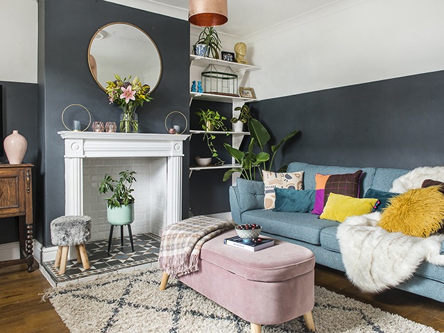
Image: Colin Poole
Walls painted in Railings by Farrow & Ball provide the perfect backdrop for the couple’s colourful pieces, including a DFS Zinc sofa and pink storage bench from Homesense. The fireplace, a Facebook Marketplace find, has been tiled in a Topps Tiles design. And hints of copper, like the pendant from First Choice Lighting and Homesense mirror, add further character to the space.
Shop Farrow & Ball Railings paint
Neutral bedroom
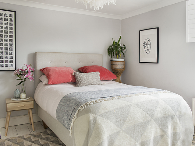
Image: Colin Poole
The white painted floorboards set the tone for this neutral scheme, where Louise picked out soft greys in the blanket from Kin and Cloth, and rug from Rug Love. The feather pendant light is from B&Q, and the coral pink cushions are from Ikea.
Artful dining area
Image: Colin Poole
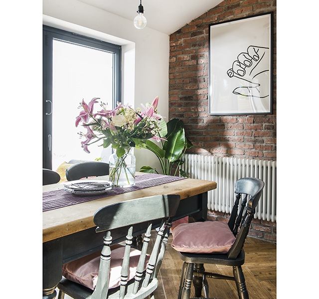
Keen bargain hunter Louise found the wooden kitchen table and chairs on Facebook Marketplace. The framed artwork from Iamfy makes a statement on the exposed brick wall.
Shop Iamfy wall art
Tasteful kitchen design
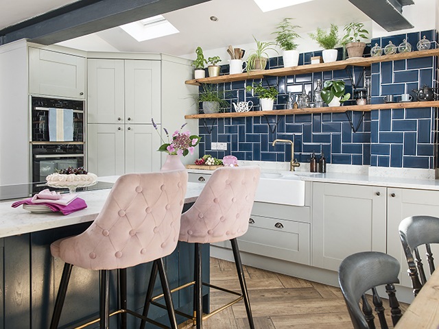
Image: Colin Poole
Now five times bigger than the original galley design, the new open-plan space is perfect for cooking and entertaining. Louise chose kitchen units by Park Furnishers complemented by a classic Belfast sink by Rak Ceramics, and Bond Street Blue metro tiles from Walls and Floors.
Shop Bond Street Blue metro tiles from Walls and Floors
Toning in with the wood-effect flooring by Walls and Floors, the kitchen shelves were made by James using floorboards from Louise’s sister’s renovation, which he sanded and oiled. Studded bar stools from Cult Furniture add the hint of pale pink that Louise has used throughout the house.
Shop wood-effect flooring by Walls and Floors
Pastel play area
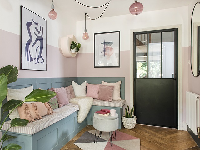
Image: Colin Poole
Part of the work included removing a wall between the hall and the kitchen to create a more open-plan layout and provide a firewall. The kids love to hang out in this cosy banquette corner. Lighting from Creative Cables sets the tone for the couple’s pink accessories, which include cushions from H&M Home, a geo rug from Aldi and shelf unit from Shelf Studio. The wall art is from Juniqe and side table by Julian Joseph.
White WFH space
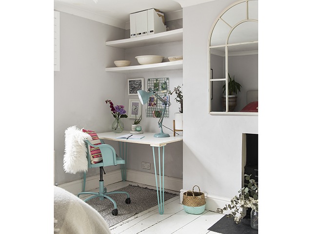
Image: Colin Poole
To create a home office, Louise took a desk top from Made.com and added legs from The Hairpin Leg Company. Next, she teamed this with a swivel chair from Ikea to create a cute study corner. The desk lamp from Homesense and metal wall rack from Sainsbury’s complete the home working space.
Bold children’s bedroom
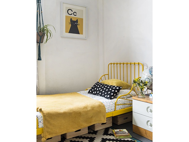 Image: Colin Poole
Louise used a yellow bed and monochrome rug from Ikea as the basis for son Alfred’s bedroom scheme. She then filled the space with savvy pieces found at vintage fairs and car-boot sales. ‘After nearly paying full price for the same one, our roll-top tub was a lucky find from a hotel closure!’
Geometric Bathroom
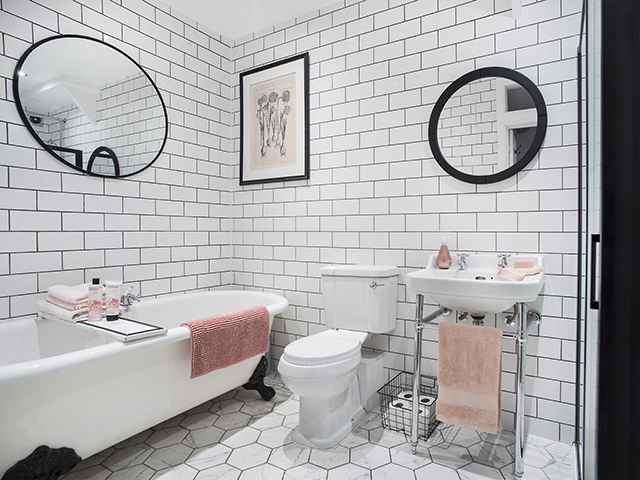
Image: Colin Poole
Simple metro tiles from Crown Tiles and floor tiles from Tons of Tiles surround Louise’s prized roll-top tub. The black framed mirror and artwork are from Homesense, with pink accessories and storage boxes softening the monochrome look.
Utility room
Image: Colin Poole
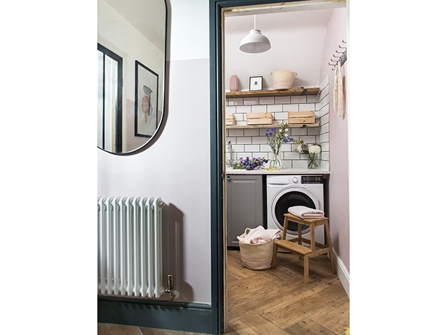
Having a separate space for practical elements like laundry means that Louise can use the kitchen solely for cooking, dining and entertaining.


