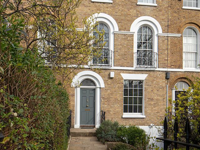
Inside this painstakingly renovated London home
With vision and plenty of patience, Nadine Pain took a once rented-out listed property and restored it to create a contemporary family home.

Image: Robert Sanderson
When Nadine Pain spotted her soon-to-be home online, she didn’t waste any time. ‘I was constantly trawling property sites, and when I spotted this five-bedroom terrace so close to our children’s school and both mine and Stephen’s work, I knew it wouldn’t hang around,’ she recalls. ‘I booked a viewing for the next day and made sure we were the very first appointment, made an offer immediately and sold our house five days later. We were in within seven weeks – it was a crazy time!’
Bedecked with huge Georgian sash windows, original shutters, ornate cornicing and feature fireplaces in almost every room, it’s easy to see why Nadine wasn’t about to let this house slip away. However, it did come with a few surprising extras she wasn’t as keen to celebrate. ‘Many of the rooms had been let out to lodgers, so the bedrooms had sinks in corners and there was a second kitchen on the third floor, plus an extra shower room off the main kitchen,’ she explains. Together with husband Stephen, she formulated a plan to piece the disjointed layout back together to form a light, bright home fit for modern living.
Kitchen
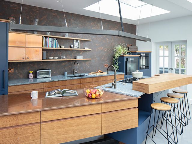
Image: Robert Sanderson
The new extension is undoubtedly the jewel in this property’s crown – the sleek, bespoke kitchen slicing through the space and jutting out at angles as it layers oak, oxidised copper, marble and steel. Dramatic navy blue emphasises the industrial slant, while a glass roof and lantern throws light into every corner, casting geometric shadows across the room. ‘I had to be persuaded at first, but I now love that we didn’t go for a plain white kitchen,’ Nadine admits. ‘It’s so unique and individual, especially the Armourcoat feature wall.’
The industrial-style design, created by Splinterworks, combines metal, stone and wood for a highly textured yet streamlined scheme. Sharp angles are an overarching theme of the bespoke cabinetry, where even the shelving tapers to a point.
Living room
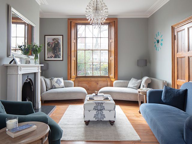
Image: Robert Sanderson
Nadine has preserved the period features in the living room, adding a few contemporary designs such as the light fitting. Renovated original wooden shutters frame the Georgian window, flanked either side by two modern chaise longues.
Shades of blue, from teal to grey, create a soothing scheme. A new archway leads through from the living room to a separate reception area, where the children practise piano.
Ensuite bathroom
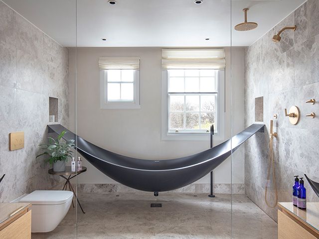
Image: Robert Sanderson
This eye-catching hammock bath tub and matching basins are what drew Nadine to designer Splinterworks, who she then commissioned to create the couple’s bespoke kitchen. The tub and walk-in shower has cleverly been sectioned off from the basin area with two panes of frameless glass by Majestic Showers.
Bedroom
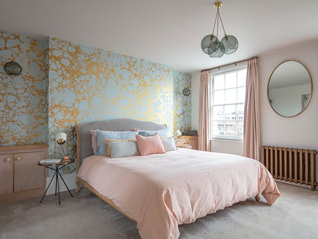
Image: Robert Sanderson
Working alongside interior designer Ruth Milne of Studio Milne, Nadine redesigned the décor of the spaces and now sink-less bedrooms. ‘Our intention was for each room to have its own style, without detracting from the original features,’ she says. Along with the transitions in colour and materials, it’s the small, clever touches that give this home its bespoke feel.
‘Stephen and I both adore our bedroom – it’s a real sanctuary for us,’ Nadine says. A subtle palette of dusky pink and powder blue forms a calming base for the gold accents of this stunning bespoke Wabi Lichen wallpaper by Calico.
Guest bathroom
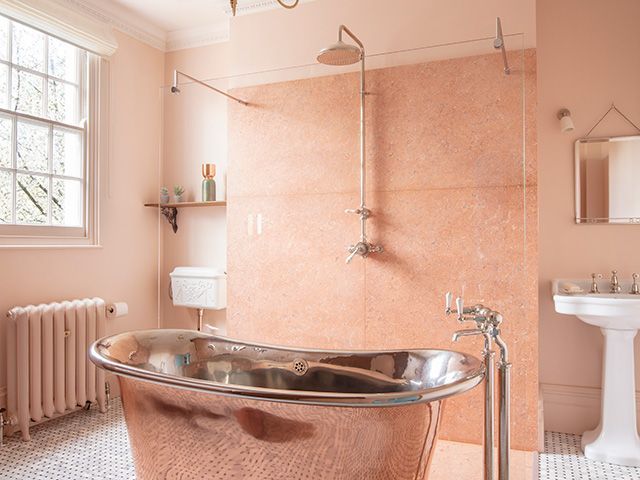
Image: Robert Sanderson
Decorated in soft plaster hues, the guest bathroom is an inviting space for visiting family and friends. Catchpole & Rye’s freestanding copper tub in the centre of the room is the perfect pairing for the Rosa Tea marble of the double-width walk-in shower with frameless glass screen.
Children’s playroom
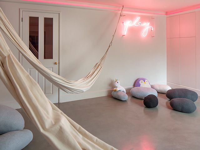
Image: Robert Sanderson
With a games room, hammocks and floor cushions, plus a film projector, Nadine has been both stylish and savvy in teenage-proofing their home. ‘Having this separate area means the kids can be as noisy as they like downstairs,’ she says. ‘It also made sense to think about how the family dymanics will change in years to come, and reinstating the external basement door as the kids’ entrance was a key part of that. I have a feeling I’ll be grateful for it!’
What do you think of this creative property? Let us know on social! Tweet us @goodhomesmag or post a comment on our Facebook page.


