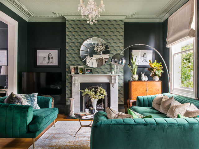
The dark hues and dramatic wallpaper continues in the living room
Dark hues and dramatic wallpaper transform this Surrey home
Interior designer Elinor Wright never tires of updating and refining her renovated five-bedroomed Victorian family home in Weybridge, balancing high-street finds with reclaimed pieces and a few luxury additions.
There was an immediate sense of belonging for Elinor Wright, when she and her husband Russell, a lawyer, found their Surrey house in 2010. ‘We’d been exploring different areas around London, but hadn’t chosen anywhere specific, as it was more about getting the right property,’ she says.
‘By complete co-incidence, I was born close to where we ended up settling, and it was lovely to find a place where I already had memories and an emotional connection.’
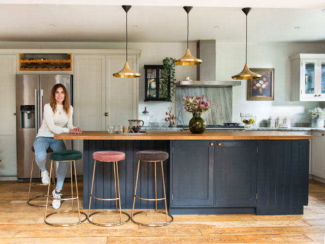
Interior designer Elinor Wright’s custom kitchen with cabinetry by Pineland Furniture is painted in Railings, Hardwicke White and Cornforth White, all from Farrow and Ball. The stools are from Rockett St George and pendant lights from Tom Dixon. Photo: Colin Poole
A period property with character and light
The couple had been keen to move from south-west London in search of more space, a greener environment and good schools for their three daughters. Elinor particularly wanted a period property with character and plenty of light.
As soon as she arrived outside the house, she made up her mind: ‘It just looked so pretty that I knew straightaway this was going to be our home,’ she says. ‘Once I got inside, I saw that the rooms were good sizes with high ceilings. It was a real find.’
Although the house had enormous potential, the bland interior was dated, with dull wallpapers, worn bathrooms and a small, old-fashioned kitchen. Having renovated their previous home, the couple were not fazed by the challenge.
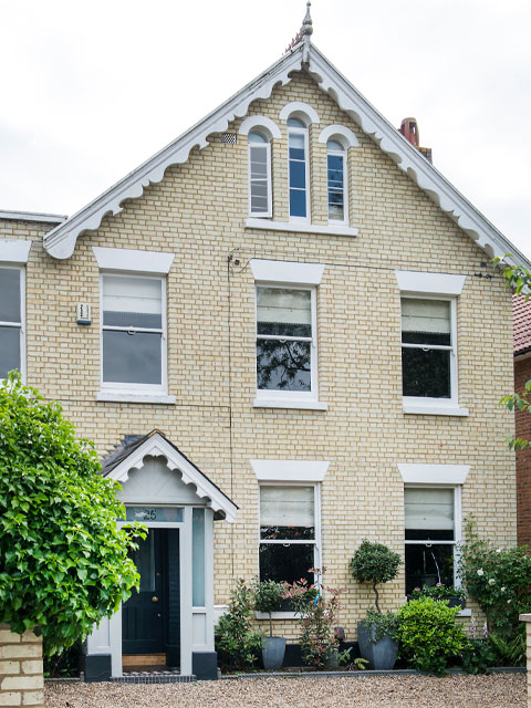
The pretty house had enormous potential, but the interior was dated, the kitchen too small and the bathrooms needed updating. Photo: Coljn Poole
Transforming the kitchen
With hindsight, though, Elinor realises they underestimated the scale of the task they were taking on: ‘We’ve made huge changes, but in phases over several years, just to make it affordable. We started with major jobs like re-wiring, and repointing the exterior. I decorated in neutrals throughout, and did some quick fixes, like painting the old, brown kitchen cupboards, just to tide us over.’
Over the years the garage has been converted into a wet room and boot room, the cellar has become a media room and home office, and the garden and drive have been landscaped.
Updating the kitchen has been one of the most transformative projects. It was tackled in two stages, three years apart. The initial work involved knocking the old kitchen and utility room together, and installing new units, appliances and flooring. To keep her budget under control, Elinor designed it herself, and had pine cabinets made to measure. ‘There weren’t too many layout options, so it’s quite simple, but really solid, and was great value,’ she says.
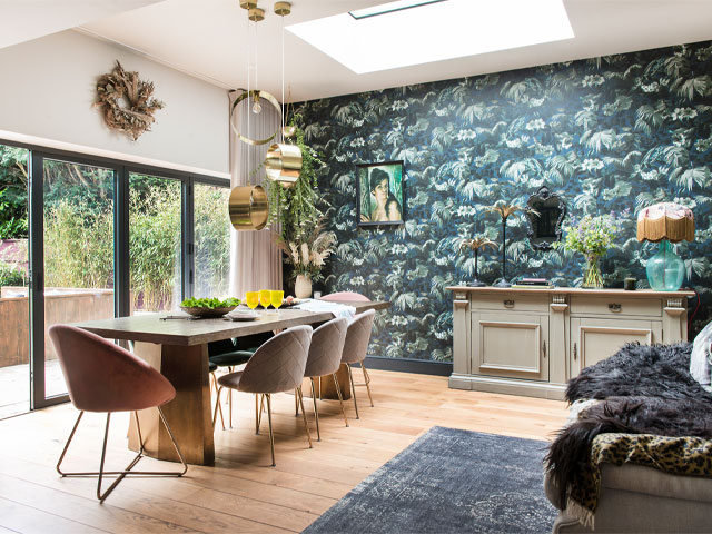
The dining room features a Barker and Stonehouse table, chairs from Cult Furniture and Rockett St George, an elegant pendant from Sweetpea and Willow and House of Hackney’s Limerence wallpaper. Photo: Colin Poole
Remodelling, repositioning and reusing
As part of the overhaul, the couple also had bi-fold doors fitted along one side, boosting light and re-orientating the space to overlook a patio. Three years later, the couple added an extension, enclosing the patio and turning it into a dining area. At that point, the bi-fold doors were simply taken out and re-positioned, creating a larger, more family-friendly space with access to the garden.
‘This gave us a lovely, sociable entertaining area, without changing the kitchen at all,’ says Elinor. ‘We re-fitted the same bi-fold doors so there was no wastage and nothing was done twice.’
Once the kitchen-diner was up and running, Elinor could rearrange and maximise other parts of the house: ‘I’ve used the rooms in several different ways, depending on our needs. When we lacked kitchen space, we had a small dining room, which became my study once we extended. I’m planning an office in the garden soon, so that’ll free up space again for something different inside.’
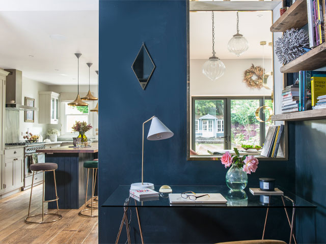
A small dining room became a study nook during remodelling. Photo: Colin Poole
Switching neutrals for dramatic hues
As the house has evolved, so has Elinor’s taste and style. Although she started out with a largely-neutral palette, combining greys and taupes with ‘shabby-chic’ elements, her long-standing penchant for dark, dramatic hues, eye-catching lighting and beautiful wallpapers became clear over time. ‘I want my home to feel warm and welcoming, but creative and interesting too,’ she says. ‘I look for statement items with character, and I do get excited about colour.’
Her look is not easy to pigeonhole, as she cleverly mixes modern with old and reclaimed, and puts high-street bargains next to designer touches. Working in interior design, she is tuned in to current trends and always keen to experiment in her own home.
‘I like trying new ideas, but I believe you should work with what you have, too.’ Interior designer Elinor Wright
‘It’s just about the things I love,’ she says. ‘I like trying new ideas, but I believe you should work with what you have, too. I can’t just replace everything in a room straightaway, so the trick is to make it look harmonious, refreshed and well-finished in the meantime, without breaking the bank.’
The elegant sitting room is a good example. Some six years ago Elinor updated its classic, neutral colour scheme, introducing contrasting shades of green on the walls and ceiling, and a bold, geometric wallpaper on the chimney breast.
‘I changed the sofas last year, but until then, I’d kept the grey ones from before, and I just painted some of the furniture dark green to blend in,’ she says, ‘I’ll recycle where I can, and I often rotate and move things about, too.’

Elinor’s multi-layered décor includes tonal walls and ceilings, in Studio Green and Card Room Green, and Arcade wallpaper on the chimney breast, all from Farrow and Ball. Photo: Colin Poole
Creating a bedroom with dressing room
Elinor’s latest revamp has been in the main bedroom, which was merged with the adjoining room, and now includes a dressing room and en suite shower room. She was ready for a break from the off-white, French-inspired décor, opting for dramatic, black, panelled walls.
Balancing her budget, she splashed out on bespoke wardrobes, marble tiling and beautiful feature wallpaper, but reined in her spend elsewhere. The panels are an inexpensive effect and most of her existing furniture has been re-used.
‘It’s a completely fresh take, and far more striking and exciting than before,’ she says.
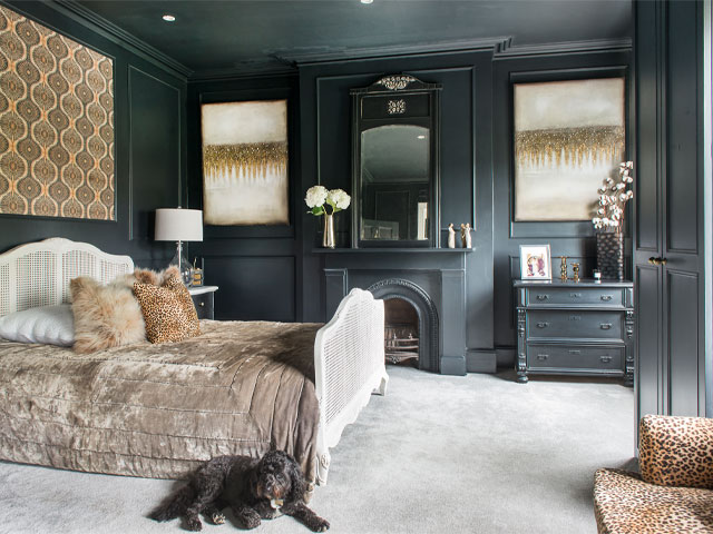
The bedroom is painted in Farrow and Ball’s Off Black with warm gold and toffee tones, including a panel of Anna Hayman’s Bibana wallpaper to lift the dark palette. Photo: Colin Poole
With her enthusiasm for colour and design, Elinor has no plans to stop updating and experimenting in her home, making changes as and when she feels inspired.
‘I think it’s important to love the things you have around you,’ she says, ‘When something catches my eye, I’ll find a way to include it and make it my own.’
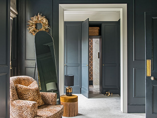
The dark, dramatic dressing room and en suite with splashes of gold and a leopard print chair from Rockett St George. Photo: Colin Poole
For more from interior designer Elinor Wright, see elinorwright.co.uk


