
Seventies rental revamp home tour: ‘It was the perfect renovation project’
Claire and Liam Kennedy took just seven months to transform a rundown 1970s rental property into their dream home
This article contains affiliate links, of which we earn a commission
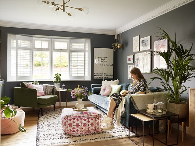
Image: Rachael Smith
When Claire (ck_homestyle) and Liam Kennedy first spotted their future home in a small Birmingham suburb, it was just what they were looking for: a doer-upper. Built in the 1970s, it was being used as a rental property and the interiors had been untouched for 20 years; plus, it had a garage and a driveway – both on Liam’s wish list. Trying to contain their excitement, they put in an offer, only to find it had already been sold.
Disappointed but hopeful that another similar property would come up, the couple went on holiday. While they were away were overjoyed to receive an unexpected call – the sale had fallen through. Thankfully, this meant that the house was now back on the market. ‘We flew straight home, put an offer in and that was it,’ recalls Claire. ‘Harborne is a popular area and difficult to buy into’. ‘As we had wanted a renovation project, we already knew the changes we wanted to make.’
The couple bought the house in December 2018 for £420,000, and it’s now worth around £500,000. Take a tour of this retro property that’s been given an on-trend transformation…
A prize find
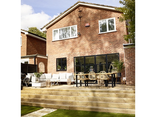
Image: Rachael Smith
Nominated by The Sunday Times in 2019 as one of Britain’s best places to live, Harborne is an area that the couple had already grown to love. They had lived there prior to moving to Leicestershire where Claire had been offered a job. Additionally, the high street has an abundance of coffee shops, restaurants and pubs, with idyllic Arts and Crafts homes built around a pond.
Inspiration
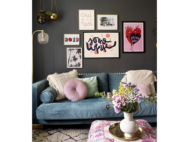
Image: Rachael Smith
Claire gathered most of her design ideas for the house online. Their furniture is an eclectic mix of Ebay finds, modern pieces and homemade furniture – including a desk and garden dining table. The colour palette that runs throughout is a warming blend of deep blues and elegant greys. This is also offset with hints of pink and aquamarine too.
‘I get a lot of style inspiration from Instagram and I look at Pinterest, too, but then my plans can evolve,’ she explains. ‘When I painted the bathroom blue, for example, I decided that I loved the colour so much I ended up using it in other areas.’
Living room
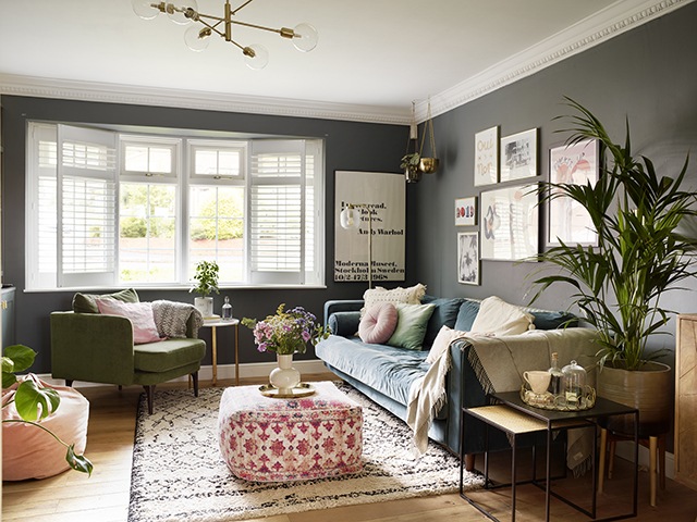
Image: Rachael Smith
By choosing Farrow & Ball’s Downpipe for the walls of this space, Claire has added a touch of drama complemented by rich velvet furniture. For example, her purchases include a blue sofa found on Ebay, a West Elm green armchair and pink pouffe from Homesense. The pink printed footstool is from John Lewis & Partners, and framed wall art from a selection at Print Club London creates a contrasting feature.
One successful project was the built-in storage either side of the living room fireplace. ‘This was achieved without spending an eye-watering amount of money,’ explains Claire. ‘We designed, measured, painted and got the MDF cut ourselves, so all in all it only cost around £400.’
Shop Farrow and Ball’s Downpipe paint
Kitchen
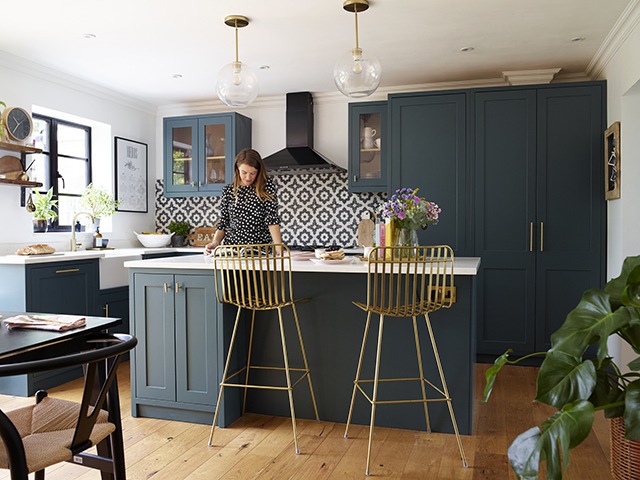
Image: Rachael Smith
Kitchen units by Shaker Doors painted in Inchyra Blue by Farrow & Ball and wall tiles by Bert & May invigorate this new open-plan space. Placing an island in front of the L-shaped layout has created a natural break. As a result, this allowed the couple to zone the kitchen and dining areas. Finally, bar stools from Rockett St George and pendant lights by West Elm complete the look.
Shop Farrow & Ball Inchyra Blue paint
Read more: 5 design ideas that complement U-shaped and L-shaped kitchens
Dining room
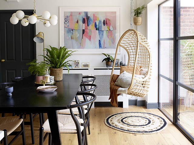
Image: Rachael Smith
The Crittall-style windows give the dining space a contemporary feel, contrasting beautifully with the warmth of the wooden flooring. A hanging chair from Arbol House, circular rug from Oliver Bonas and Hans Wegner-style chairs from Only Home add natural texture. These accessories are complemented by colourful artwork by Lola Donoghue.
Buy circular rug from Oliver Bonas
Utility room
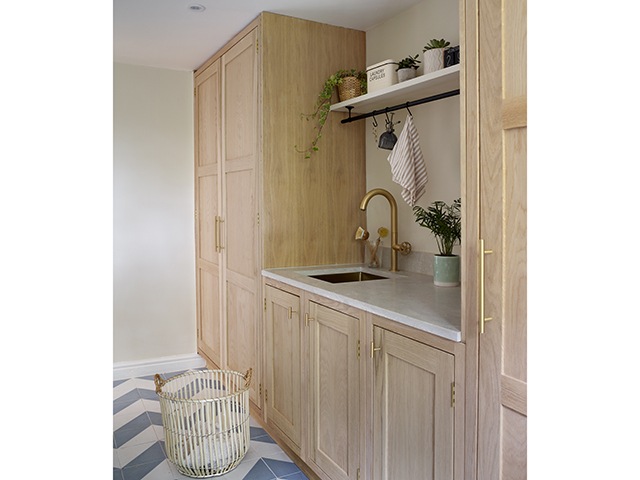
Image: Rachael Smith
With walls painted in Farrow & Ball’s School House White, this spacious area doubles as a home office, so Clare chose smart features, including chevron floor tiles by Claybrook. The worktop by Karonia Surfaces is finished with a sink and tap by Olif.
Shop Farrow & Ball’s School House White
Cloakroom
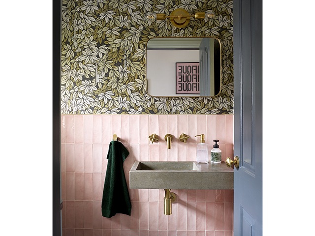
Image: Rachael Smith
This compact yet stunning space combines Cole & Son’s Chiavi Segrete wallpaper with vertically laid pink wall tiles and brass fittings. A double wall light by Spark & Bell illuminates a retro-style mirror below by William Wood Mirrors.
Hallway
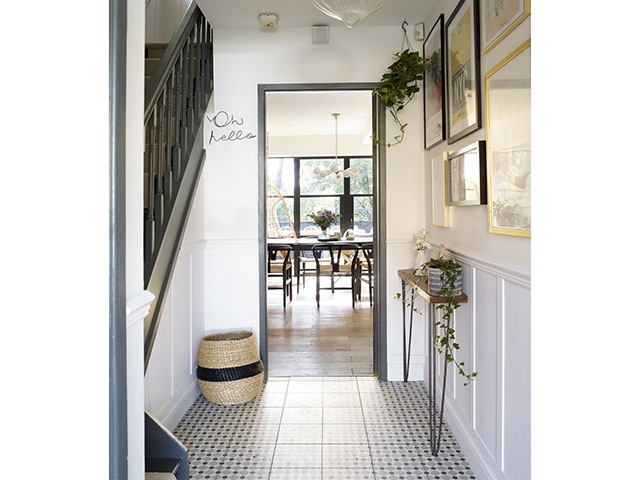
Image: Rachael Smith
Initially, Claire painted the walls in a dark shade but found it made the space feel smaller, so swapped it for Farrow & Ball’s Wevet. A slimline console table from Cedar & Sawdust is the perfect solution for a hall, and patterned flooring by Tiles Direct adds interest underfoot. The Oh Hello artwork is from The Wire Room.
Shop Farrow & Ball’s Wevet
Read more: 6 decorating tips for a durable hallway
Main bedroom
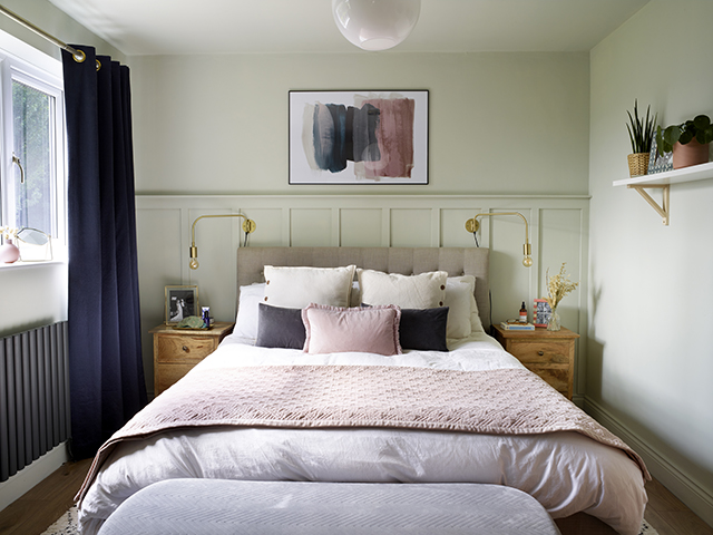
Image: Rachael Smith
Picking out the shades from the Desenio print above the bed for this scheme, Claire chose Farrow & Ball’s Cromarty for the wall panelling to provide a calming backdrop. The upholstered bed is from Arista Living, with the throw and cushions from H&M Home.
Create a bespoke bed with Arista Living
En suite
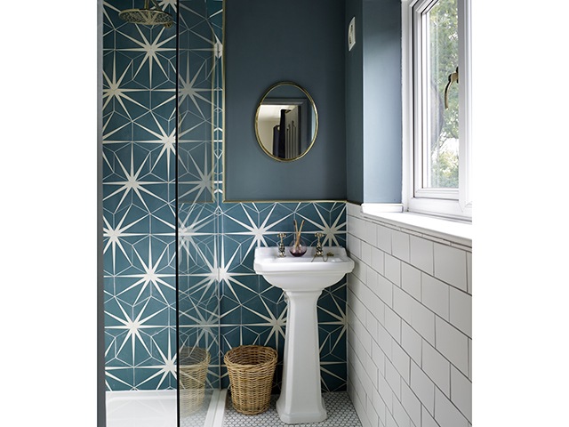
Image: Rachael Smith
Smart use of space allowed the couple to create a dressing area and en suite. They did this by removing a wardrobe in the main bedroom and knocking through a box room. Colour wise, they chose a rich shade of teal, gold accents and mosaic floor.
Guest bedroom
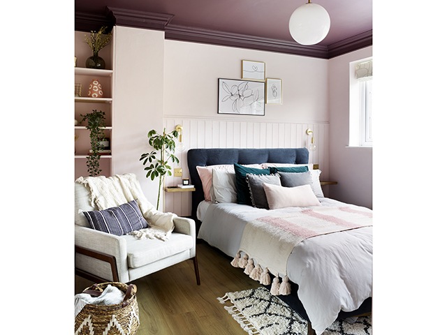
Image: Rachael Smith
Painting the ceiling in a darker shade adds warmth to this pale pink scheme. Claire chose an upholstered bed by Furniture & Choice, with gold wall lights by Industville either side. The cream chair is from West Elm, and framed wall art by Juniqe.
Read more: How to create a guest-ready spare bedroom
Bathroom
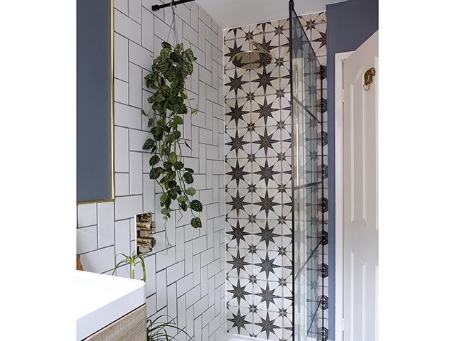
By knocking out the boiler, the couple were able to add a walk-in shower – a must-have for the new design. Claire chose a striking combination of metro and Metropolis Star wall and floor tiles from Tons of Tiles, and painted the walls in Farrow & Ball’s De Nimes.


