


Image Credit: YesColours
8 colour theories interior designers swear by
Decorating your home can be exciting, but the number of different design options can also make it confusing and overwhelming – particularly when it comes to choosing your colour palette.
Picking the hues to use in each space of your home is fraught with difficulty, even if you have a strong idea of the colours you love.
That’s because there’s so many factors at play: from the direction the room is facing to the existing colours of your furniture and not knowing how to successfully blend colours in a cohesive rather than conflicting way.
To complicate matters further it seems many of us are somewhat colour-phobic, with a recent survey by BestHeating revealing over two thirds of Brits (70%) have no idea which colours go well together.
And, of course, the stakes can be high because if you get it wrong you’ll have to live with your colour choice every day.
So, it’s little wonder that many wannabe decorators err on the side of caution when it comes to picking a palette.
But colour is one of the simplest most inexpensive ways to give your space a lift – with a fresh coat of paint having the ability to totally transform a room.
What’s more, 80% of Brits believe the colours we use in our homes can have a positive effect on our mood and overall wellbeing. So there’s a lot to think about when choosing a colour scheme.
Thankfully, when it comes to decorating with colour there are some tried-and-tested rules, theories and formulas interior designers have discovered over the years.
“Many of us hesitate to use bold colours in our homes, finding them daunting or overwhelming,” explains Emma Bestley, co-founder and creative director of YesColours.
“However, this fear can be eased by understanding the principles of colour in interior design.
When used thoughtfully, colour creates balance and harmony, evoking the right emotions in a space.
Knowing how colours interact allows for intentional combinations that enhance a room’s character, improve functionality, and bring a design vision to life.”
From applying the 60-30-10 rule to understanding the principles of the colour wheel, we spoke to the experts on how to unlock colour-confidence when decorating your home.
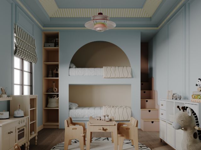
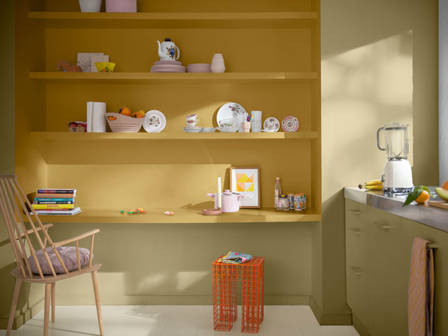
Understand the 60-30-10 colour theory rule
When it comes to picking the colour scheme for your space, Molly Woodward-Moor, interior designer and creative director at Stone Superstore recommends first defining your vision and overall aesthetic whether that’s ultra-modern, eclectic, or rustic and choosing a colour palette that compliments this theme.
“A classic interior rule that helps to create a cohesive colour palette is the 60-30-10 method,” Molly explains.
The idea is you pick three colours and divide them into three: dominant colour, secondary colour, and accent colour.
“Start by choosing your dominant colour that reflects the overall mood you’re aiming to create, this could be a neutral white, beige, or a bold statement such as a deep maroon,” Molly explains.
“The base colour should be used to cover the larger areas of the room such as walls, ceilings, and flooring.”
Your secondary shade should cover 30% of the room to add depth and visual interest to the space.
“The second colour should complement your statement shade, rather than overpowering it and could be used for larger pieces of furniture, rugs, curtains or beddings,” Molly adds.
Lastly, your 10% should go towards the accent colour, which should be used throughout the room sparingly to add a pop of contrast and to bring the overall mood of the space together.
“The accent shade could be used in small décor pieces like artwork, soft furnishings, or decoration. By following this rule, you’ll be able to create a visually appealing and cohesive look that will feel balanced.”
Optimise the colour wheel
The colour wheel is used to understand relationships between different colours.
“It consists of primary colours (red, yellow, blue), secondary colours (green, orange, purple), and tertiary colours (such as red-orange or yellow-green),” explains Johanna Constantinou, trends expert at Tapi Carpets & Floors.
Understanding colour theory also requires knowing about mixers.
“Sadly not an accompaniment to your favourite tipple, but hues, tints, tones, and shades.
The make-up of the colour wheel,” explains colour expert Tash Bradley, director of interior design at Lick.
- Hue: another term for colour. The pure colour.
- Tint: the pure colour, mixed with white.
- Tone: the pure colour, mixed with grey.
- Shade: the pure colour, mixed with black.
Tash says there are three basic colour schemes that are worth knowing; complementary, monochromatic and analogous.
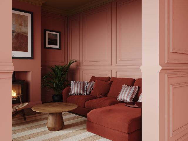
Complementary colours
The go-to choice for decorators. “A complementary colour scheme uses hues from opposite sides of the colour wheel,” Tash explains.
She suggests picking your favourite paint colour, then pairing it with its opposite.
“Not only does this allow you to be more varied with your selection, it creates a look that’s naturally appealing to the eye,” she adds.
“Whether you opt for muted tones or full saturation, a complementary colour scheme is such a success thanks to opposites working together in perfect contrasting harmony.”
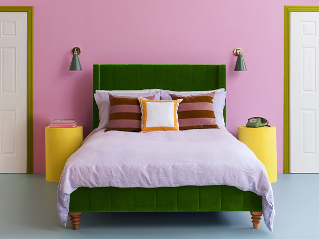
Tash says some basic complementary colour schemes include: pink and green and blue and orange.
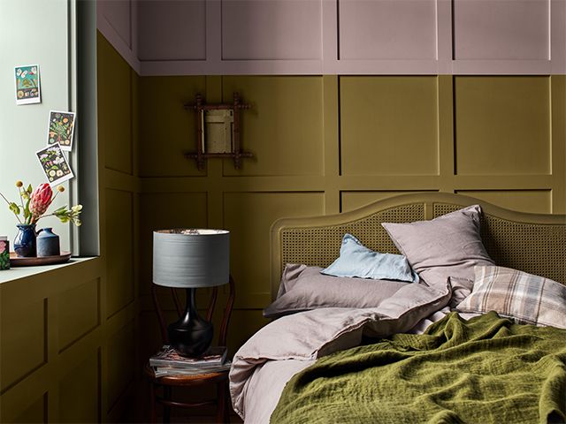
Monochromatic colour schemes
Often mistakenly referred to as black and white, Tash says monochrome actually comes from the Greek ‘mono’ meaning one and ‘khroma’ meaning colour.
“A monochromatic scheme refers to any colour scheme which uses just one colour that’s lightened (tinted) with white or darkened (shaded) with black,” she explains.
“For example, a monochromatic blue scheme could consist of a dark navy, going right up to a pale duck egg, all from one base hue.”
Tash says these schemes are often referred to as tonal, and can give a harmonious, visually cohesive look.
“Tonal, monochromatic schemes can make a room feel relaxing and considered, but – dare I say it – if you play it super-safe it could run the risk of just feeling a little boring,” she continues.
“Technically speaking it can be quite hard to create a completely monochromatic room, so this is often used as shorthand for a space that features a monochromatic paint colour palette, but perhaps brings in a little contrast with accessories or art.”
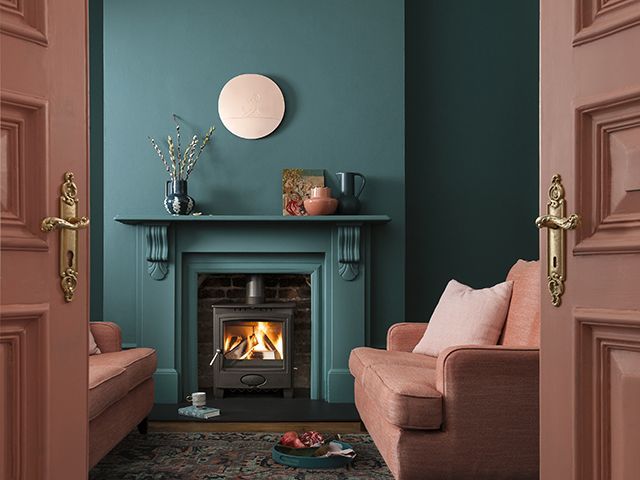
Analogous colour schemes
When it comes to the analogous colour scheme, Tash says three is most definitely the magic number.
“This colour grouping is a selection of shades, tints, and tones that sit next (or very close) to one another on the colour wheel,” she explains.
“Think of it as three best friends that won’t be separated.
“Green, who sits next to turquoise, who sits next to blue. They get along famously.
“They look great together. Now, who can argue with that?”
Tash adds that analogous colour schemes are a great choice if you want to create a natural feel and a sense of flow.
Test out your colour theory
In terms of colour and design, the colour wheel is a useful tool used in colour theory to show the relationships between different colours, however, though it is great for inspiration it only takes you so far.
Once you’ve come up with an idea for a scheme, Emma suggests building a mood board.
“Include images you come across in your colour scheme as well as objects that will accessorise with it and even quotes that you feel could inspire the scheme,” she recommends.
“While you’re slowly piecing your mood board together, get ordering paint swatches and paint samples in your chosen colour schemes so you can play about with them and start picking actual paint colours.”
Emma also suggests testing your paint samples at various times of day and on different walls to see how different light affects them.
Balance warm vs cool colours
The warm vs cool rule is a key principle in colour theory, helping people to create spaces with specific moods and atmospheres.
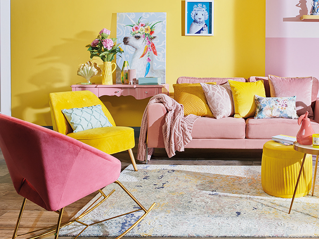
“Warm colours, such as red, orange, and yellow, create a sense of energy, comfort, and warmth, making them ideal for lively, social spaces,” says Johanna.
“Conversely, cool colours, such as blue, green, and purple, induce a calming, soothing effect, perfect for where relaxation or focus is essential,” she explains.
When it comes to balancing warm and cool tones, while a predominantly warm palette can make a space feel inviting, adding cool tones provides contrast and depth.
“Similarly, a primarily cool-toned room can benefit from warm accents to avoid feeling too sterile or cold,” Johanna concludes.
Utilise colour psychology
When you combine a variety of colours in one area, apart from considering what each colour means in the world of psychology, Emma recommends asking yourself how they will work together and which feelings you would like to evoke in that room.
“This will determine the decision on what tone of colour and colour family to choose from,” she says.
“Multiple colour options provide infinite possibilities and give each space in your home identity.”
If you’re looking to achieve an energetic feel Emma suggests opting for bold vibrant colours on the complimentary wheel.
“This could be navy and peach, pinky hues paired with green or optimistic yellows and lilacs.
“The eye instantly recognises these contrasts, creating a dramatic and powerful look,” she adds.
If you’re in need of a space which provides tranquillity, Emma recommends choosing less intimidating colour groupings from the same colour family.
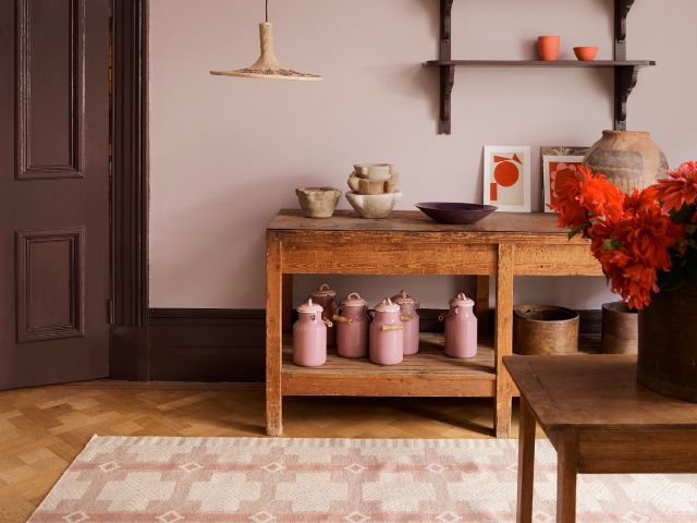
“Consider warm tones such as pinks, reds, oranges and yellow hues,” she says.
“Pair neutral warmer creams alongside yellow and pinks for a nurturing, comforting palette, or move towards the cooler colours of green, blue and purples.
“Finally, a cooler grey alongside Teal and Aqua colours will work well together for a soothing, cocooning palette.”
Know how to successfully colour clash
Colour clashing adds a fun, uplifting backdrop to an interior space.
“You can either choose to make a statement with rich bold colours or tone it down a little with a softer tonal palette,” Emma explains.
To ease yourself in, Emma recommends experimenting with a few homeware accessories to see if colour clashing is for you.
“Remember, you can always tone a colour scheme down by incorporating one or two neutrals,” she adds.
“Look at a colour wheel and assess the complementary colours, for example yellow/purple, blue/orange and red/green.
“This is an effective way of providing inspiration for a colour clash, but you are safe in the knowledge that scientifically, these colours go together, they just appear a braver combination than what you would usually go for.”
Emma says you can also bunch colours together by their ‘temperature’.
“Warm colours being reds, oranges and yellows, versus cool colours; greens, blues and purples,” she adds.
“You can keep it safe by having white and grey tones on the wall and pairing it with a few bright accents. It will be more subtle, but there’s still that injection of fun in small doses,” Emma continues.
“Clashing can be provocative but also demonstrates originality in a scheme, so pick one of your favourite dominant colours and start placing them against all colours on the colour wheel.
“I guarantee you will find something that sings to you.”
Learn the room orientation rule
The natural light a room receives can have a big impact on colour.
To find the right shade for your space it is worth finding out what your room’s orientation is, ie, whether it’s north, south, east or west-facing.
When it comes to decorating a north-facing room, Emma says the most important rule is to embrace warmer colours or colours with warm undertones.
“This will help to counter balance the cooler light that’s usually present in a north-facing space and make the room look and feel more comfortable and inviting,” she adds.
Some tried and tested paint colour options for a north-facing room are warm peaches, pale yellows, warm cappuccino-toned neutrals and generally anything with a warmer undertone.
“Cool tones, such as lavender and cool green hues are to be avoided,” Emma continues.
“Cool paint colours are only going to make the space look colder, which, naturally, is the last thing we want in a north-facing room.”
If you do like cooler tones and definitely want to use one in this particular space, Emma suggests trying one with a little bit of extra warmth to soften it.
Try a tonal colour scheme
Another way to bring a colour you love into your home is through a tonal schemes which offers a perfect middle ground.
“Here you use the same colours but simply change the tone,” Emma adds. “By harmonising one colour in lighter and darker shades, you can achieve a unified and serene atmosphere.”
Looking for more interiors inspiration? Take a look at Nostalgiacore decor: 15 ways to embrace the look in your home or The ‘Frazzled English Woman’ aesthetic: 9 ways to get the look in your home
READ MORE: