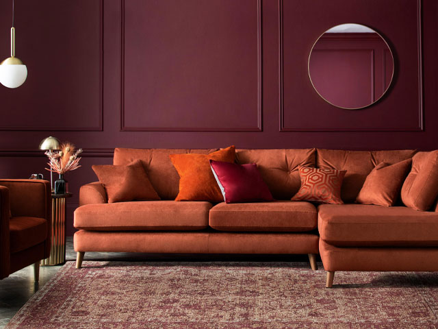
Image Credit: Next
10 ways to decorate with divisive colours
When it comes to the colours we choose in our homes, it can be tempting to stick to neutrals and familiar palettes – but it seems some of us are feeling the urge to be braver with the hues we introduce to our spaces.
The problem is opting for choices traditionally considered risky can be somewhat divisive – with recent research from Dulux suggesting that more than a quarter of Britons fall out over paint colours when decorating their homes. And, it turns out, it isn’t just our other halves we are disagreeing with when it comes to colour palettes.
According to the same Dulux study, friends and housemates are even more likely to fight over paint than couples, but with interiors experts predicting a pull to more out-there colour choices we could soon be finding it even more tricky to agree on shades.
So what’s driving this desire to be divisive? Molly Woodward-Moor, interior designer, and creative director at Stone Superstore says the lure of more unique colour palettes could be a reaction to the traditionally safe hues we’ve previously embraced.
“In recent years, there’s been a strong shift away from minimalist, neutral palettes, towards more expressive and personalised spaces,” she explains.
“Opting for more unusual colours can help to bring a sense of individuality and warmth to a space in contrast to the starkness of past trends that focus on chalky whites and cool toned greys.”
It’s one thing being drawn to more unexpected colours, but quite another making them work in your home.
“Colour is incredibly personal,” explains Tash Bradley, Lick’s director of interior design and colour psychologist.
“One person’s divisive colour will be another person’s dream colour. And when decorating a home with someone who has different tastes to you, there may well be some compromise involved.
“However, there are some clever decorating tricks that will help you bring that divisive colour you love into your home, so that you can feel free to express yourself and create a home that still feels like a reflection of you.”
If you’re interested in going for bolder hues, even if it might upset your other half, here’s how to introduce some divisive colours in a cohesive way.
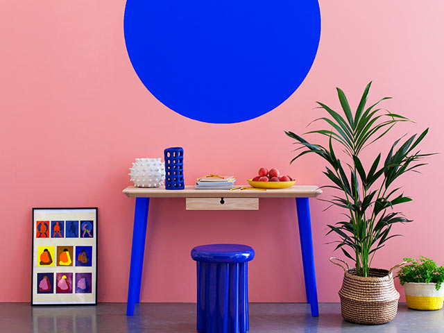
Popular divisive colours to decorate with
Pink
Pink was once considered an unusual colour for interiors, especially outside of children’s rooms however, it’s become increasingly popular in recent years as designers and homeowners embrace its versatility and sophistication.
“Soft shades like blush, dusty rose, and muted pinks are seen as modern neutrals, offering warmth and softness without overwhelming a space,” Molly explains.
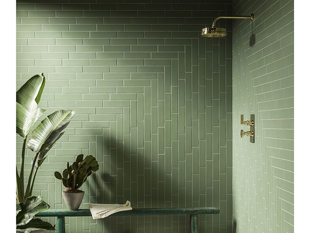
“Pink and green are a particularly popular colour combination, which feels natural and refreshing, often linked to floral or botanical themes.”
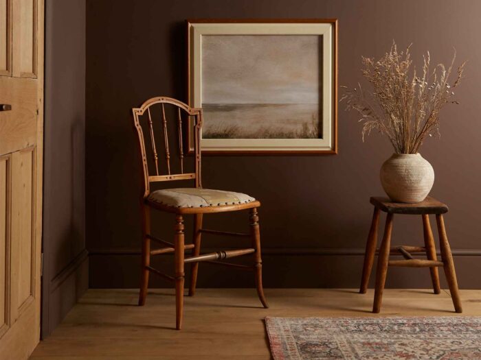
Brown
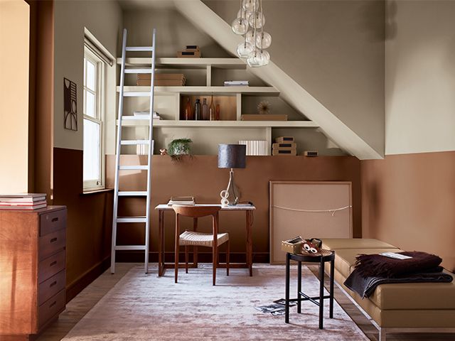
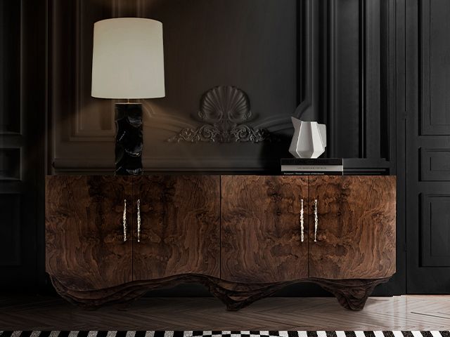
Brown has previously been banished to interiors room 1010, but according to Molly earthy, rich shades of brown have been on the rise as they evoke warmth, comfort, and a rustic sense of nature.
“The varied shades of brown help to create a sense of stability and cosiness, making a space feel more intimate,” she explains.
“The shade mimics natural elements such as wood, helping to foster a closer connection to nature which many people find calming.”
Bold, rich tones
Designers are also embracing the use of bold rich tones such as deep navy, terracotta, along with elevated warm toned neutrals.
Within this Molly includes the Dulux colour of the year for 2025 – True Joy.
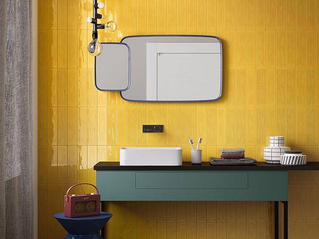
“This vibrant and energising shade of mustard yellow feels both uplifting and cosy,” she says.
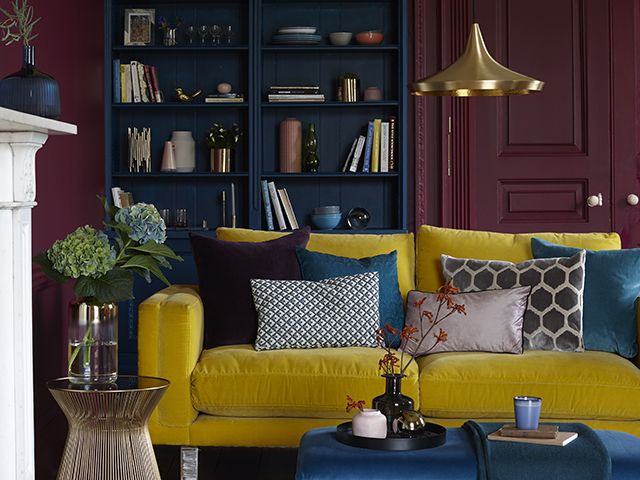
Yellow and green
Yellow and green should always be seen! Despite this combo having historically been considered an unfavourable option due to being adjacent on the colour wheel (which often creates too much contrast) yellow, and green are experiencing a resurgence in home décor.
Molly believes the reason could be down to people embracing more vibrant, nature-inspired colour schemes.
“Yellow, symbolising energy and warmth, pairs beautifully with green’s calming, natural qualities when used thoughtfully,” she says.
“Designers today are also using more muted, sophisticated shades of yellow (like mustard) and green (such as sage or olive), which complement each other without clashing.
“This updated approach to the pairing aims to offer a cheerful and fresh vibe to interiors, with more emphasis on creativity and personal expression,” she adds.
How to decorate with divisive colours
It’s understandable people are unsure about thinking outside the Pantone box, but diversifying colour choices in your home can breathe new life into your space, helping to make it fresh and inviting, whilst also contributing to the overall ambience.
Introduce pops of colour
If you’re looking to add a more unique hue to an already existing scheme, Molly suggests introducing a new colour by incorporating small pops throughout via accessories like cushions, throws, or artwork which can easily be swapped out if you want to change the vibe later.
Try the 60-30-10 rule
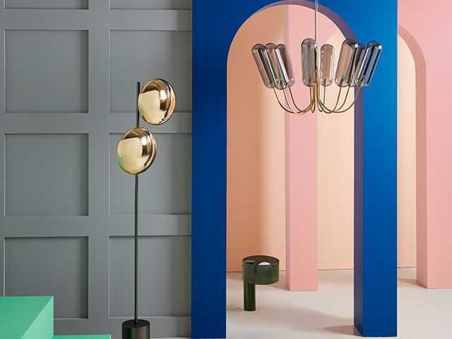
If you’re creating a new scheme from scratch, experts recommend adopting the 60-30-10 rule.
“This will help you create a clean and consistent colour palette, starting with your primary statement colour which should be allocated to 60% of the room,” Molly explains.
“Your secondary shade should cover 30% of the room to add depth and visual interest to the space,” she continues.
“Your second colour should complement your statement shade, rather than overpowering it and could be used for larger pieces of furniture, rugs, curtains or beddings.”
Lastly Molly says the accent colour should be used throughout the room sparingly to add a pop of contrast and bring the overall mood of the space together.
“The accent shade could be used in small décor pieces like artwork, soft furnishings, or decoration,” she says.
“By following this rule, you’ll be able to create a visually appealing and cohesive look that will feel balanced.”
Use your ceiling as a ‘fifth wall’
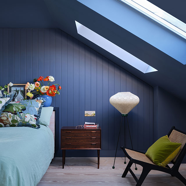
A great way to bring a divisive colour into your home is by painting it on your ceiling (aka the ‘fifth wall‘) and keeping your walls comparatively neutral.
“This will create a lovely surprise without a space feeling over-stimulating or over-powering to those who may find the colour divisive,” explains Tash.
“Darker colours like our deep rich Purple 03 or earthy Brown 02 will also bring the ceiling height down, making a room feel cosier and more cocooning, making them the perfect choice for snuggly sitting rooms.”
Don’t shy away from controversial combos
While brown pairs so beautifully with all natural textures such as woods and warm stone, it can also look edgy and modern when mixed with pops of bright colour.
“A tobacco brown mixed with eye popping fuchsia is a stunning colour combination, and chocolate mixed with a warm turmeric yellow will set any home glowing,” explains textile designer, Clarissa Hulse.
Clarissa suggests using divisive colours for upholstering a sofa in a rich velvet, or if you are feeling a bit more brave, a painted wall or wallpaper.
“This means you can layer in pretty much any colour of the divisive colour and it will blend seamlessly into your scheme.”
Opt for a tonal colour scheme
Another way to bring a divisive colour you love into your home is through tonal colour schemes.
“Tonal colour schemes involve using one colour in a variety of tones, tints, and shades of it,” explains Tash.
“Let’s take red as an example, working our way along each of its iterations. By adding white, you get pink, a ‘tint’ of red. Add black, and you get a lovely maroon purple, a ‘shade’ of red. And there you have it: a monochromatic, tonal colour scheme of pink, red, and maroon.”
By opting for a tonal colour scheme (bringing these colour iterations into everything from your walls to your furniture and upholstery), Tash says you will create visual harmony in your space, toning down the darker shades.
Create balance
A great way to introduce a new more divisive colour to your home is to include aspects as part of an overall colour scheme, rather than going all out with one shade.
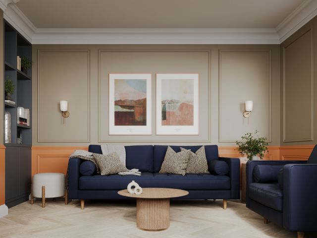
“To create balance, pair orange, with deep blues and soft neutrals and choose accessories that harmonise the palette,” suggests Natalie Mudd, co-founder and creative director, Knot & Grain.
“Remember that your flooring choice plays a crucial part in complementing your chosen colour scheme.
“To soften bolder hues, look to choose natural flooring with warm undertones, such as engineered wood.
“Introducing natural materials and textures can help to ground an interior scheme, in turn softening the intensity of a more adventurous colour palette.”
Create a ‘surprise and delight moment’
According to Tash a simple way to bring in a colour you love is by creating a ‘surprise and delight moment’.
“This could involve painting the inside of a cupboard or a drinks cabinet, so when you open it up you can see the beautiful colour, and just as easily close it up if your household members are not a fan,” she explains.
Mix up the woodwork and walls
Painting your woodwork the same colour as your walls is a look that’s increasingly popping up on Pinterest boards, but if you’re using a divisive colour in your scheme it could be worth using different hues on your walls and wood.
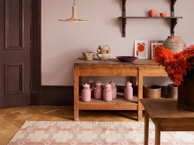
Flora Hogg interior designer and colour consultant at Craig & Rose suggests starting small by trailing the colour combination out on a smaller area, whether that be a fireplace or window frame, then extending it to the rest of the woodwork in the room.
“Pairing Clove Brown with Lady Emma, a soft lavender hue, highlights the subtle purple undertone to create a harmonious and complementary combination,” she advises.
“Try using the Clove Brown on woodwork and Lady Emma on the walls.”
Create a colour zone
If you’re nervous about pushing yourself out of your colour comfort zone, Emma Bestley, creative director and co-Founder of YesColours suggests creating a little zone of colour in one section of the house.
“Try a bold colour around shoe or coat rack area or an energising splash of colour near a desk space, these pockets of paint will bring the area to life and are great at zoning the space in compact or open plan spaces,” she explains.
Don’t shy away from a divisive colour drench
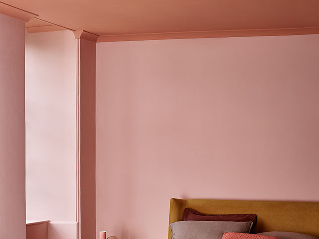
Colour drenching is taking one colour and painting everything from your walls to your woodwork in it. “Think skirting-boards, radiators, doors, window frames, picture rails and ceilings,” advises Tash.
Interestingly, colour drenching a space in one colour can actually tone down the intensity of the colour.
“By painting everything one colour, there is no contrast for your eye to focus on,” Tash explains.
“Corners and edges are softened, the line between the wall and the ceiling blends, which makes a space feel more expansive.”
Eliminating contrast can also make a colour feel softer.
“Say, for example, you have a room painted in dark brown with white woodwork – the dark brown will appear stronger and more saturated by contrast,” Tash explains.
“A room colour drenched in dark brown – walls, woodwork, ceiling, the lot – however, will make the brown appear softer and the walls blend.
“We never see colour in isolation – it is the combination of colours that determines how our eyes adjust to them.”
If you’re planning to colour drench your entire space with a divisive colour Becca Stern, creative director and co-founder of Mustard Made suggests taking time to pick the right shade.
“The only pitfall is picking the wrong colour for you or your space,” she says. “Spot test your paint on different walls and in different lights.
“Do your research in advance to find out what is available in terms of furnishings and decor in that colour so you can make a really well-informed colour choice.
“Personally, I’d look for depth in a shade, something interesting or intriguing rather than flat and one dimensional.”
How to overcome divisive colour conflict
Deciding on a colour scheme can be one of the biggest conflicts when decorating a space with a partner or housemate.
Molly says it is important to start by identifying any colours or tones you both like. “Neutral tones, like beige or soft taupe, can serve as a base, providing a backdrop for a colour scheme,” she adds.
When you’re selecting your complimentary colours, consider the purpose of the room to help guide the palette choice.
“If a space is meant to be a calming retreat, you might lean towards more subdued tones, whilst a room that’s meant for entertaining might take a brighter approach,” Molly continues.
If there’s conflict in the introduction of a new bold colour, try easing the change into the space through smaller, less permanent updates.
“This could be with subtle soft furnishings such as cushions and blankets, this way you can test the use of colour in the space without overwhelming the room or your partner,” Molly suggests.
Additionally, she suggests creating a mood board with your ideal colour palette, this way you can visually see how each colour pairs with the other.
“It can also help you both to understand how to incorporate the use of colour into your space and how your styles can complement each other,” Molly adds.
Looking for more interiors inspiration? Take a look at Demure interiors: 10 ways to get the look in your home or 8 trends interior designers will be adopting this autumn.


