Before and after coastal-inspired kitchen makeover
To reflect its seaside location, Paula Etherington redesigned her space using a natural palette.

Browsing a property website a few years ago, Paula Etherington found herself drawn to an Edwardian home in Hove, East Sussex. The mum-of-two was initially attracted by its location: the house was close to great schools and the station, plus it was near the beach and only 10 minutes from Brighton. It also had an unusually large garden for the area. ‘When I looked into it, I discovered the building had previously been a dental practice,’ she explains, ‘and it was a complete shell. I’ve developed properties before, so was ready for a new challenge.’
There was certainly plenty of work to do. The half-existing kitchen was situated upstairs and there was no bathroom, only a WC. Despite needing little structural changes and no planning permission, the project still required four months’ work by a team of recommended local builders: R&R Building Services.
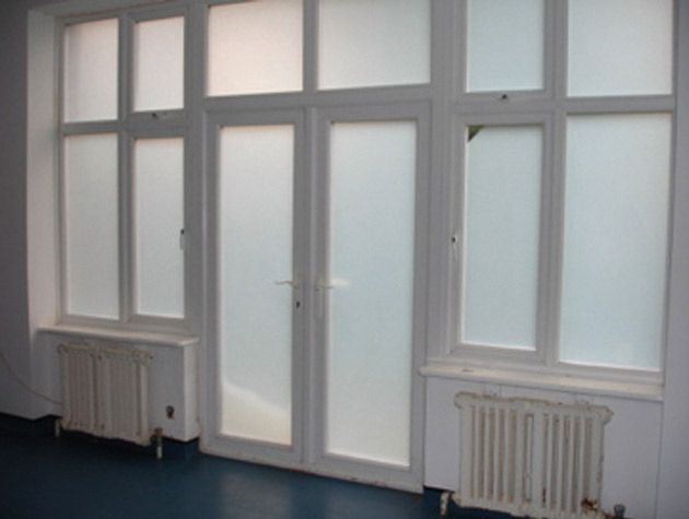
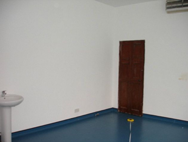
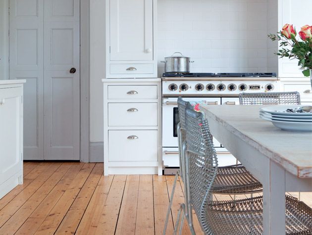
The plus point was that Paula had the luxury of working with a blank canvas to design her ideal kitchen, and decided to use the room at the back of the house that opened out to the garden. Its thick-blue lino and frosted glass were the first things to go: ‘It took lots of elbow grease to get the flooring up,’ she says, ‘and then the original pine boards were sanded and varnished.’ As with most Edwardian houses, the rectangular shape dictated the layout before Paula had even had a chance to think about it – units on three walls and a dining table and chairs in the middle, leaving the windows and French doors unobstructed. Conveniently, the existing second doorway at the end of the room led on to part of the hallway where there was already a WC and storage space, which she converted into a utility room.
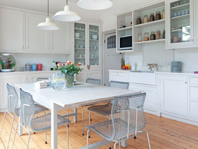
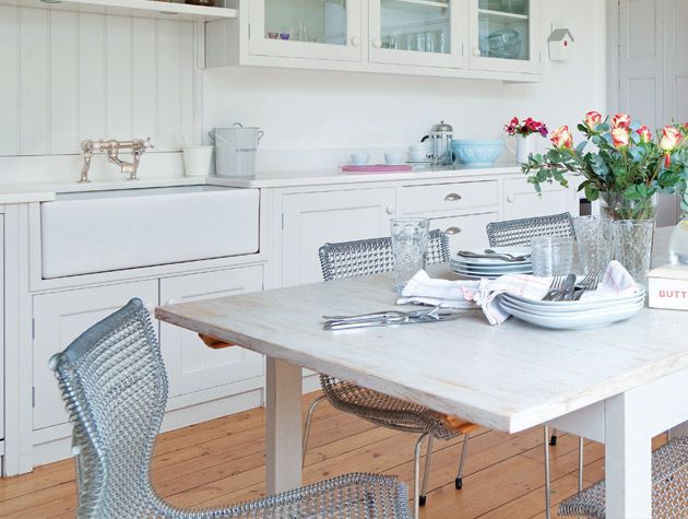
Having always been a fan of Plain English kitchens for its simple and versatile designs, Paula worked with Abri Furniture in nearby Haywards Heath to come up with a similar bespoke look. The lines of the resultant handcrafted units are clean and elegant but retain a classic rustic charm, while integrating all the necessary appliances. ‘My style is a combination of old and new,’ explains Paula, ‘I like mixing vintage and modern pieces together – and I love a bargain.’
Before Image
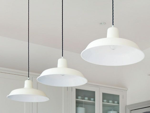
Paula settled on a subdued scheme in varying shades of white and grey, which creates a very light and peaceful environment. Even the extendable table from Ikea was customised to match: ‘It was in an oak finish when I bought it, but I painted it to complement the rest of the kitchen,’ she explains, ‘and the chalky tone of the pendant lights remind me of the nearby coastline.’ Warmth comes from the wood floor and accents of colour in linens, flowers and fun pictures dotted with magnets on the American-style fridge freezer.
Before Image
Pleasingly, the entire project went pretty much to plan – a fantastic result for a complete renovation. Paula’s close proximity certainly helped things run smoothly. ‘Because I was living nearby throughout the build, I was able to look in regularly to check on how things were going,’ she explains. ‘The builders also kept me informed regarding any cost issues, so I was able to manage my budget accordingly.’
From her wide experience of developing other properties, Paula stresses the importance of shopping around and forging relationships with local companies and tradesmen, as well as o ering excellent interiordesign advice. ‘Don’t be afraid to merge di erent styles,’ she says. ‘And don’t be too precious – revisit old things that you’ve put in the loft and forgotten about.’
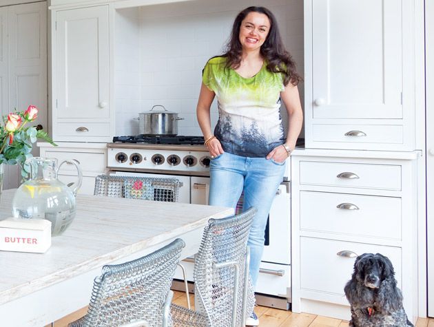
With a spacious dining area, granite worksurfaces, useful storage, and gorgeous garden views, Paula is delighted with the end result. And encouraged by friends’ enthusiastic responses, she now also undertakes commissions as Paula Church Interior Design. ‘It’s lovely to sit here and relax with a cup of co ee and a magazine with the doors wide open in the summer,’ she says. ‘It’s simply my favourite spot to be.’
Photography: Fiona Walker-Arnott


