
Miami vibes colourful kitchen makeover
Miami-style kitchen makeover
Christine Hughes, who works in marketing, and her partner David Harris, a teacher, wanted to create a colourful kitchen that opens up into the dining room. As well as creating a more efficient layout and family friendly space, the couple wanted to add some vibrance.
Good Homes magazine takes a look around the Miami-vibes space they created…
What didn’t you like about your previous kitchen?
Pretty much everything, to be honest. It was dark, had very little worktop space and felt closed off from the dining room, with access through an archway. Although the units were fairly new and in good shape (we actually decided to sell them to save them from going to the tip), the layout was awkward, with the sink and some essentially useless surface space in a little lean-to addition at the back. A large cupboard that housed the hot-water tank and boiler also took up valuable room.
[twenty20 img1=”16902″ img2=”16903″ offset=”0.5″]
How did you decide to change the space?
The lean-to was structurally in terrible shape, so we had it rebuilt with wraparound bi-fold doors on the corner to bring in more light and create better outdoor access. We have a small garden and didn’t want to lose any of it, and didn’t see a huge advantage in extending to square off the back of the house to make the kitchen larger, so we stuck to the original footprint and reworked the space. This included moving the washing machine under the stairs, while installing a new boiler meant there was space for the fridge where the water tank used to be.
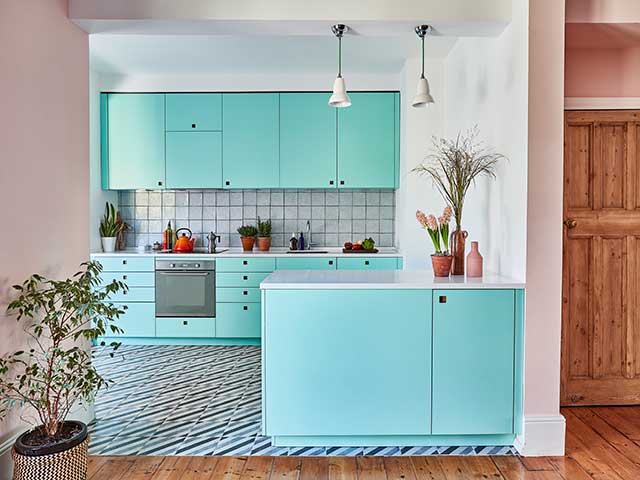
Photo: Malcolm Menzies
Why did you choose your kitchen company?
We came across Pluck as they are practically our neighbours, and we were keen to support a local business. We were able to go to the workshop to see how the kitchens are made, and loved their close attention to detail and ideas for a colourful kitchen. We were after a bit of a statement look as well, so Pluck was perfect.
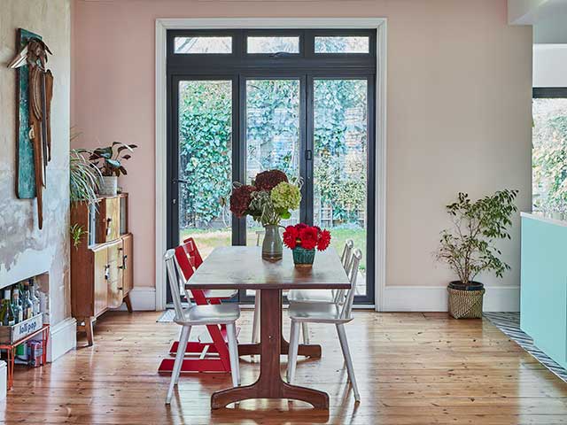
Photo: Malcolm Menzies
What was your brief to them?
It was pretty straightforward – bright and cheerful with ceiling-height cupboards, as I hated the wasted space on top of our old units. The shade we chose, called Lido, is gorgeous and creates a 1980s Miami vibe when paired with our salmon-pink dining room. The Corian worktop also has a very subtle sparkle to it, which makes me happy whenever I look at it.
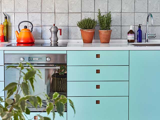
Photo: Malcolm Menzies
Tell us about the new layout
We moved to this house from an open-plan flat that was very sociable, so we wanted something similar. With the interior wall removed, the new peninsular unit faces the dining area and helps define the spaces. I toyed with the idea of finding a vintage haberdashery counter, but opted for a design that matched the units instead. It was the right decision and is more practical.
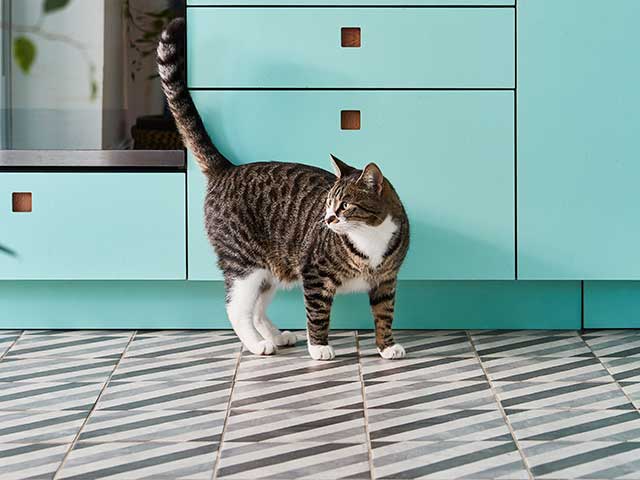
Photo: Malcolm Menzies
What was your budget?
We spent around £80,000, but this included other work in the house – not only the rebuild and kitchen – as we also added three sets of floor-to-ceiling bi-fold doors in the kitchen and living room.
Did everything go to plan?
We had great builders, and it was finished on time and within budget. In the middle of the project, a stray cat turned up in our garden and decided he wanted to stay. The builders were very obliging about letting him in and out all day – and we even had a cat door fitted!

Photo: Malcolm Menzies
How do you feel about your new colourful kitchen?
We just love it. It’s so bright and colourful, and feels very ‘us’.
Project costs
Cabinetry £10,336
Worktops £3,600
Appliances £2,228
Tiles £628
Sink & tap £665
Lighting £190
Total spend: £17,647


