
Kitchen makeover: “It’s now cheerful, cosy and sociable!”
Mirukshi and Tim Brunton didn’t follow the crowd when it came to designing a new family living space.
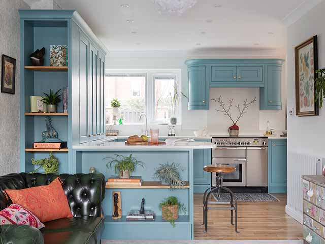
Image: Paul Craig
The couple wanted to replan the downstairs layout with a new kitchen and living area which flows better. To do this, they removed an old conservatory which also increased the size of their garden. The owners of the property are Mirukshi Brunton, an interior architect and learning environment project manager at Teesside University, and freelance designer (@studio.miruk), and her husband Tim, a senior lecturer at Teesside University; together they have a daughter, Alula who is 8.
[twenty20 img1=”13652″ img2=”13650″ offset=”0.5″]
What didn’t you like about your old kitchen?
Apart from looking dated, it had an abundance of storage but no social space. The living area downstairs was divided into separate rooms and rather disjointed, so it was difficult to gather together as a family.
How did you want to change the space?
We removed the conservatory to increase the size of the garden and reduce the footprint of the house, which sounds counterintuitive but has worked for us.
We blocked the kitchen door from the hallway, removed two internal walls and created a larger opening to the garden, so the main living areas now flow from one to another in a ‘U’ shape around the central staircase and hallway. The kitchen is in one corner, with one curved peninsula at the snug side and another facing the dining room.
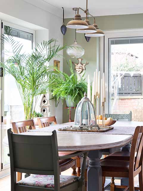
Image: Paul Craig
What were your must-have features?
The sun can be really strong at the back of the house, so we had integrated blinds fitted within the glazed units for the bi-fold doors and kitchen window. The LED-lit breakfast larder unit now also hides the boiler and the coffee machine, toaster, and other morning essentials.
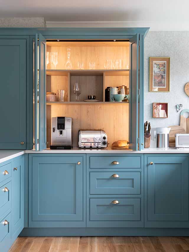
Image: Paul Craig
Did you have a project budget in mind?
We had set aside £50,000 to include all the building work and decorating, and hoped to have enough left to get the garden done as well. We wanted to send as little waste as possible to landfill, so sold on any items that were in still in good condition, including the old units and PVC sliding doors. As an interior architect, I was able design the new scheme, and Tim and I project-managed the work ourselves, which saved us around £2,000.
Did anything cost more than expected?
As the space is open plan, we felt the new kitchen needed to be something that was of excellent quality and beautiful in design, and discovered the colourful units by Second Nature. It cost around £23,000 in total, including appliances and installation, which was a little more than we originally anticipated, but still within our budget.
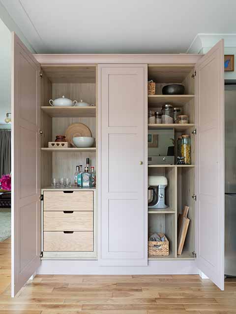
Image: Paul Craig
Were there any disasters along the way?
Thankfully no! Local company Jolly Kitchens supplied and fitted the kitchen, and their professionalism, quality of work and patience with my constant queries made for a smooth-running project.
What was the biggest lesson you learned?
To forget all the current trends and go for something that works for us. After some reflection, we completely ignored the standard kitchen ‘triangle’ principle and designed our scheme with zones for prepping, cooking, cleaning up, socialising and storage – it suits our needs perfectly.
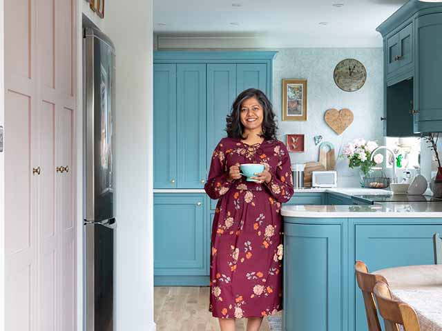
Image: Paul Craig
Did you stick to your original budget?
Yes. Once we had the build budget fixed, we then looked at the kitchen design and cost, and set that. This allowed us to get the garden landscaped too, all within our £50,000 price bracket.
How do you feel now it’s all finished? Having lived in the house for almost 18 years, we just wish we had done it sooner! The new layout completely fits in with how we want to live. It is a cheerful, cosy and social living space that we are really proud of, and we just love spending time in here as a family.
Project costs
- Cabinetry £10,886
- Worktops £3,735
- Appliances £3,130
- Flooring £800
- Sink & tap £416
- Lighting £250
Total spend: £19,217
Are you impressed with this kitchen makeover? Tweet us at @goodhomesmag or post a comment on our Facebook page!


